 MaxedOutMama
Wednesday, February 02, 2011
Technically Graphing
Most readers will not find this very interesting. You don't have any obligation to read it.
I referred to the second upswing in CFNAI in response to Teri last week. I realize that was abstruse. This post will allow readers to assess whether it was obtuse.
First, let's consider CFNAI and Treasury yields in tandem. CFNAI is a composite index composed of data on production, income, employment/unemployment, sales, inventories & orders, personal consumption, and housing. It is inflation adjusted. It's published by the Chicago Fed. CFNAI page.
Treasury yields are the effective rate of return on US treasuries. Treasury page. Since as price increases, yield drops, and as yields rise, prices drop, changes in treasury yields, and most importantly the relationship between yields of different maturities, have historically been believed to measure demand for money in the economy at large. (This, of course, may not be true forever. If the US continues on its present path, eventually we will reach the point at which we are at risk for default. At that point, treasury yields will measure risk and demand for money. But historically, this has not been much of a factor.)
It goes without question that CFNAI and treasury yields, especially a comparison of yields for different maturities (aka the treasury yield curve) are derived very differently. To compare the two:
CFNAI-MA3 (the three month moving average of CFNAI) from the CFNAI page linked above.

Treasuries:

These two graphs are for different time periods. This one starts at 1990. Open it up in another tab or page to really look at it.
What this graph shows are differences between the yields of various maturities.
For example, the blue line labeled Diff 6M/3M is the 6 month yield - 3 month yield for that date.
There's a whole lot one could say about this graph, but the first thing is that if you look at CFNAI and this one, there is a remarkable correspondence. Admittedly, the sharp dips show up first in treasuries, and they correct first also. The sharp upslopes in this graph after a long collapse to points below zero occur before a recession has officially started.
I take the phase-shifted correspondence between CFNAI to be de facto proof that the relationship between treasury yields of different maturities does measure demand for money, that it does so in a way that seems predictive of real world outcomes, and that analyzing treasury yields in this way does tell us something about Main Street.
There's lots more of interest about this graph. The green/maroon pairing are the difference between the 5 Year treasury and the 6 Month, and the 5 Year and the 1 Year. Those form a correlated pair. The Orange/Yellow pair the difference between the 1 Year and the 3 Month and the 2 Year and the 6 Month. The kind of baseline blue is the difference between the 6 Month and the 3 Month. That last measures very near-term demand. The 1/3 captures much of the production cycle, the 2/6 picks up a lot of investment funding/building, and the 5/6 and 5/1 start picking up longer term investments and probably auto buying. I don't mean to suggest that this all they pick up - I am just trying to convey how I think about these, and how I believe these relationships are linked to the economy.
If you're still here, reading this, and you don't see the very strong correspondence between CFNAI and this graph, look at the 1990s on both graphs. See how, beginning in 94 and extending into 95, there is a long hard fall in the yield relationships? Now look at CFNAI, and you see the same dip just a bit later. You also see another dip later in the late 1990s. That's the effect of the Asian currency crisis. The entire second half of the 1990s shows up as a very different period. The dot.com bubble diverted a lot of money into what turned out often to be illusory investments. This was a period in which corporate accounting became very innovative indeed, and a lot of cash was diverted into chasing those returns. But financing investments was very easy; this was the era of borrowing through stock offerings, and I believe it shows up on this graph.
As a final note, you see that the long collapse in yield differences preceding both the 2001 and 2007 recession occurred long before the official recessions. In fact, in both cases the curve was beginning to correct before the official onset date. But the damage had already occurred, and inevitably that showed up in the real economy.
The fact that this shows up so clearly is, to me, a type of proof that the Austrian theory of business cycles trumps Keynes. Keynes is economic Prozac; the Austrians predict.
But back to the graph. All three of you who are still reading, please look at the peaks on the graph after recessions. You see the double hump? Differences maximize, then drop, then rise again. That second rise seems to correspond with the popular US street perception of when a recession is truly "over". You see the same thing in a less marked manner in CFNAI.
This is why I say that the economy has unkinked and has some carrying strength. It looks like we are taking that second rise. Therefore employment should begin to really improve. The first hump seems to reflect the inventory cycle. Then that clears. It is possible to clear that cycle and go into a double dip recession (that is how I see the 1980s cycle), but if then you have a dip and move into the second rise, you are amending, and powerful structural forces should take over and keep the economy expanding.
Now I have been have a prolonged argument with myself for an entire year. Because although treasury yield relationships do seem to forecast recessions, they do not give you accurate dating for the precise emergence in the real world. What does is consumer buying patterns.
When I go to stores, I see that there is real weakness in consumer buying. The top echelon stores are doing well, and as you move down the ladder, the weakness becomes more and more evident. It is very possible in these circumstances that we could go into a stone-skipping type of economic deal in which recessions (episodes of contraction) can appear quite often, although probably with shorter extents.
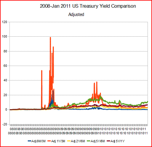
As a result of this inner controversy and a concern that ZIRPing ad astra might have an effect, I modified these graphs somewhat. This "adjusted" series takes the difference as a percentage of the base comparison rate. Example: (1 year yield - 3 month yield)/3 month yield.
And here is the same data presented that way:
 It is clear that we have a scaling problem.
Due to The Fed That Did, the 2008-current period kind of damps out all other signals.
The idea is that ZIRP shoves a lot of money into banks. The basic of bank operations is that banks make money by borrowing short cheaply and lending long somewhat more expensively. The spread is the profit, minus expenses. The money that banks get is taken from households and businesses. Consider it a tax. ZIRP hikes that tax.
Borrowing short and lending long is a great business as long as you do not lose the money and as long as you do not get caught lending long at low rates while short rates have drastically risen. Either one will kill you; therefore the theoretical benefits of ZIRP do not show up that much in the real world.
In practice, under a ZIRP regime you can afford to take no risks at all in lending, the costs of servicing smaller accounts tend to drown out the low rates, thus negating the deposit advantage, and the dire possibility of getting caught in a huge rate squeeze tends to make you just not lend on anything that's not gold-plated. The only really long-term lending you can do is that which you can hand off via securitizations, etc. This is why banks are so leery of writing portfolio loans with longer durations nowadays. Unless they can dump the loans, they can't afford to write a bunch of 30 year mortgages at market rates. My belief is that ZIRP is a deflationary policy because it must and will constrict lending, thus shrinking the money supply and decreasing the velocity of money. Once the first deflationary pulse moves through the system, the moneyness of assets takes a huge step down, which sends another deflationary pulse through the system. These waves of reinforcing monetary contraction can continue for a very long time.
Due to the scaling problem, I broke this presentation into two segments - the non-ZIRP era and the ZIRP era.

ZIRP started in 2008. For simplicity sake, this graph ends with 2007.
It looks quite similar to the first one above. The same features are evident.
You notice that we cross the zero line and start heading up before the NBER start of the recession.
The Era of ZIRP:

Those orange pulses are shocks. The second orange pulse has mostly to do with European banking problems.
What I don't like about this, and the reason I have been so uncertain over the past year, is the very poor 5Y/1Y.
It's just not where it should be. It does seem to be legging up a bit, but it's not great and I think it indicates a real weakness in business investment.
Nonetheless, given the current good freight figures, we seem like to stagger through the first six months of the year.
As consumers unload more and more bad debt, they will have more income to spend. However some of the larger purchases a consumer makes require far more in the way of money. Thus we seem likely to have entered on a period of much lower growth. People need to save, but banks cannot afford to lend.
One of the reasons I find some of the Keynesian-focused economic analysis kind of nitwitted is that the entire function of the banking system is to allow me to save without withdrawing money from the marketplace. For a bank to accept my money, it has to be able to stick it back out there with someone who is going to spend it. But a ZIRP policy makes it hard for banks to lend long. Banks can lend to the treasury by buying treasuries, but that means the treasury constantly has to spend money to offset that problem.
There is a real possibility of another contraction cycle.
Finally, if you go back and look at all the treasury graphs in succession, concentrate on the behavior of the blue line. The normal behavior of the blue line is somewhat flat. The space above zero in the non-adjusted graph should tell you something about current growth trends. Also, when the blue line suddenly pops up while you have a longer falling trend of longer relationships, it's like a signal that the trend is starting to shift.
There is a very real possibility that the recent spate of Fed buying is artificially shifting these curves up. So watch the blue line.
Now, for any brave soul still with me, I have to confess that I really want to continue this. I would like to discuss more about ZIRP and bank lending.
The purpose of a data dump like this is to invite commentary. The worst possible groupthink is the Groupthink Of One. I don't have a lot of people to discuss this type of thing with. So if you have something to say, even if it appears cruel, I would appreciate it.
I referred to the second upswing in CFNAI in response to Teri last week. I realize that was abstruse. This post will allow readers to assess whether it was obtuse.
First, let's consider CFNAI and Treasury yields in tandem. CFNAI is a composite index composed of data on production, income, employment/unemployment, sales, inventories & orders, personal consumption, and housing. It is inflation adjusted. It's published by the Chicago Fed. CFNAI page.
Treasury yields are the effective rate of return on US treasuries. Treasury page. Since as price increases, yield drops, and as yields rise, prices drop, changes in treasury yields, and most importantly the relationship between yields of different maturities, have historically been believed to measure demand for money in the economy at large. (This, of course, may not be true forever. If the US continues on its present path, eventually we will reach the point at which we are at risk for default. At that point, treasury yields will measure risk and demand for money. But historically, this has not been much of a factor.)
It goes without question that CFNAI and treasury yields, especially a comparison of yields for different maturities (aka the treasury yield curve) are derived very differently. To compare the two:
CFNAI-MA3 (the three month moving average of CFNAI) from the CFNAI page linked above.
Treasuries:

These two graphs are for different time periods. This one starts at 1990. Open it up in another tab or page to really look at it.
What this graph shows are differences between the yields of various maturities.
For example, the blue line labeled Diff 6M/3M is the 6 month yield - 3 month yield for that date.
There's a whole lot one could say about this graph, but the first thing is that if you look at CFNAI and this one, there is a remarkable correspondence. Admittedly, the sharp dips show up first in treasuries, and they correct first also. The sharp upslopes in this graph after a long collapse to points below zero occur before a recession has officially started.
I take the phase-shifted correspondence between CFNAI to be de facto proof that the relationship between treasury yields of different maturities does measure demand for money, that it does so in a way that seems predictive of real world outcomes, and that analyzing treasury yields in this way does tell us something about Main Street.
There's lots more of interest about this graph. The green/maroon pairing are the difference between the 5 Year treasury and the 6 Month, and the 5 Year and the 1 Year. Those form a correlated pair. The Orange/Yellow pair the difference between the 1 Year and the 3 Month and the 2 Year and the 6 Month. The kind of baseline blue is the difference between the 6 Month and the 3 Month. That last measures very near-term demand. The 1/3 captures much of the production cycle, the 2/6 picks up a lot of investment funding/building, and the 5/6 and 5/1 start picking up longer term investments and probably auto buying. I don't mean to suggest that this all they pick up - I am just trying to convey how I think about these, and how I believe these relationships are linked to the economy.
If you're still here, reading this, and you don't see the very strong correspondence between CFNAI and this graph, look at the 1990s on both graphs. See how, beginning in 94 and extending into 95, there is a long hard fall in the yield relationships? Now look at CFNAI, and you see the same dip just a bit later. You also see another dip later in the late 1990s. That's the effect of the Asian currency crisis. The entire second half of the 1990s shows up as a very different period. The dot.com bubble diverted a lot of money into what turned out often to be illusory investments. This was a period in which corporate accounting became very innovative indeed, and a lot of cash was diverted into chasing those returns. But financing investments was very easy; this was the era of borrowing through stock offerings, and I believe it shows up on this graph.
As a final note, you see that the long collapse in yield differences preceding both the 2001 and 2007 recession occurred long before the official recessions. In fact, in both cases the curve was beginning to correct before the official onset date. But the damage had already occurred, and inevitably that showed up in the real economy.
The fact that this shows up so clearly is, to me, a type of proof that the Austrian theory of business cycles trumps Keynes. Keynes is economic Prozac; the Austrians predict.
But back to the graph. All three of you who are still reading, please look at the peaks on the graph after recessions. You see the double hump? Differences maximize, then drop, then rise again. That second rise seems to correspond with the popular US street perception of when a recession is truly "over". You see the same thing in a less marked manner in CFNAI.
This is why I say that the economy has unkinked and has some carrying strength. It looks like we are taking that second rise. Therefore employment should begin to really improve. The first hump seems to reflect the inventory cycle. Then that clears. It is possible to clear that cycle and go into a double dip recession (that is how I see the 1980s cycle), but if then you have a dip and move into the second rise, you are amending, and powerful structural forces should take over and keep the economy expanding.
Now I have been have a prolonged argument with myself for an entire year. Because although treasury yield relationships do seem to forecast recessions, they do not give you accurate dating for the precise emergence in the real world. What does is consumer buying patterns.
When I go to stores, I see that there is real weakness in consumer buying. The top echelon stores are doing well, and as you move down the ladder, the weakness becomes more and more evident. It is very possible in these circumstances that we could go into a stone-skipping type of economic deal in which recessions (episodes of contraction) can appear quite often, although probably with shorter extents.
As a result of this inner controversy and a concern that ZIRPing ad astra might have an effect, I modified these graphs somewhat. This "adjusted" series takes the difference as a percentage of the base comparison rate. Example: (1 year yield - 3 month yield)/3 month yield.
And here is the same data presented that way:
 It is clear that we have a scaling problem.
Due to The Fed That Did, the 2008-current period kind of damps out all other signals.
The idea is that ZIRP shoves a lot of money into banks. The basic of bank operations is that banks make money by borrowing short cheaply and lending long somewhat more expensively. The spread is the profit, minus expenses. The money that banks get is taken from households and businesses. Consider it a tax. ZIRP hikes that tax.
Borrowing short and lending long is a great business as long as you do not lose the money and as long as you do not get caught lending long at low rates while short rates have drastically risen. Either one will kill you; therefore the theoretical benefits of ZIRP do not show up that much in the real world.
In practice, under a ZIRP regime you can afford to take no risks at all in lending, the costs of servicing smaller accounts tend to drown out the low rates, thus negating the deposit advantage, and the dire possibility of getting caught in a huge rate squeeze tends to make you just not lend on anything that's not gold-plated. The only really long-term lending you can do is that which you can hand off via securitizations, etc. This is why banks are so leery of writing portfolio loans with longer durations nowadays. Unless they can dump the loans, they can't afford to write a bunch of 30 year mortgages at market rates. My belief is that ZIRP is a deflationary policy because it must and will constrict lending, thus shrinking the money supply and decreasing the velocity of money. Once the first deflationary pulse moves through the system, the moneyness of assets takes a huge step down, which sends another deflationary pulse through the system. These waves of reinforcing monetary contraction can continue for a very long time.
Due to the scaling problem, I broke this presentation into two segments - the non-ZIRP era and the ZIRP era.

ZIRP started in 2008. For simplicity sake, this graph ends with 2007.
It looks quite similar to the first one above. The same features are evident.
You notice that we cross the zero line and start heading up before the NBER start of the recession.
The Era of ZIRP:
Those orange pulses are shocks. The second orange pulse has mostly to do with European banking problems.
What I don't like about this, and the reason I have been so uncertain over the past year, is the very poor 5Y/1Y.
It's just not where it should be. It does seem to be legging up a bit, but it's not great and I think it indicates a real weakness in business investment.
Nonetheless, given the current good freight figures, we seem like to stagger through the first six months of the year.
As consumers unload more and more bad debt, they will have more income to spend. However some of the larger purchases a consumer makes require far more in the way of money. Thus we seem likely to have entered on a period of much lower growth. People need to save, but banks cannot afford to lend.
One of the reasons I find some of the Keynesian-focused economic analysis kind of nitwitted is that the entire function of the banking system is to allow me to save without withdrawing money from the marketplace. For a bank to accept my money, it has to be able to stick it back out there with someone who is going to spend it. But a ZIRP policy makes it hard for banks to lend long. Banks can lend to the treasury by buying treasuries, but that means the treasury constantly has to spend money to offset that problem.
There is a real possibility of another contraction cycle.
Finally, if you go back and look at all the treasury graphs in succession, concentrate on the behavior of the blue line. The normal behavior of the blue line is somewhat flat. The space above zero in the non-adjusted graph should tell you something about current growth trends. Also, when the blue line suddenly pops up while you have a longer falling trend of longer relationships, it's like a signal that the trend is starting to shift.
There is a very real possibility that the recent spate of Fed buying is artificially shifting these curves up. So watch the blue line.
Now, for any brave soul still with me, I have to confess that I really want to continue this. I would like to discuss more about ZIRP and bank lending.
The purpose of a data dump like this is to invite commentary. The worst possible groupthink is the Groupthink Of One. I don't have a lot of people to discuss this type of thing with. So if you have something to say, even if it appears cruel, I would appreciate it.
Comments:
<< Home
Hmmm. So ZIRP is deflationary. That would certainly explain Japan; they've been in ZIRP for 20 years.

It also makes me wonder whether Mellon's advice was the right advice after all. It would have been very painful, but my understanding is that the 19th century panics had a similar trajectory.
As a long time investor, always looking for an edge, this seems an attempt to read the interest rate patterns to make predictions about what the economy might do. Am I close to right? I'm always interested in market signals.
One thing was apparent, the blue line shows the steepnes of the yield curve, does it not? A steep yield curve has been an indicator for lo these many years as a good condition for equity investors. The flat to inverted yield curve (bad conditions for equity investors) leading up to the financial crisis was used by some to plan their exit from the stock market. However, it was flat for quite some time before the market actually broke down. Not exactly a pin point timing indicator.
Correlating the 5Y/6M curve with the 6M/3M seems it might have some value.
Is your goal to be able to recommend lending policies or as a predictor of economic changes?
Or am I not getting the gist of the research?
# posted by  : 8:47 PM
: 8:47 PM
I remember reading a number of analysts starting in, maybe, 2003 or so who thought that interest rates were too low. Not because they'd cause inflation but because they'd cause deflation by precisely the mechanism you describe. A couple of them even (correctly, in my view) chalked up the housing bubble and securitization to the banks' need to make a profit by other means.
None of them really had a handle on the consequences, though, more's the pity.
None of them really had a handle on the consequences, though, more's the pity.
Thanks for a very educative post.
I'm in agreement that "..we seem likely to have entered on a period of much lower growth. People need to save, but banks cannot afford to lend."
The labour participation rate is a worry; rising input costs are another; real wages aren't looking all that great either.
To top all that no one knows the true quality of the "assets" the banks are carrying at "mark to model" valuations.
Can growth gain sure, and seamless, traction in the face of all this I wonder.
# posted by : 11:59 PM
: 11:59 PM
I think I followed your analysis. Deflation for items
that have to be financed. possible inflation for
day to day items due to dollar devaluation, and
lower wages for employees and they compete
with foreign workers and higher commodity prices
for dollars allocated for production.
Sporkfed
that have to be financed. possible inflation for
day to day items due to dollar devaluation, and
lower wages for employees and they compete
with foreign workers and higher commodity prices
for dollars allocated for production.
Sporkfed
# posted by : 5:22 AM
: 5:22 AM
I worked my way through this this morning. I would not even try at 10PM last night.
Let me make sure I understand this. Since the Treasury chart is a chart of difference in yields it eliminates any effect of the actual yield. So, the difference between 1% and 2% is the same point as the difference between 5% and 6%. Also, when we get the dreaded inverted yield curve (which is usually a precursor to a recession), that is when we dip below 0 on the Treasury chart.
I liked "Keynes is economic Prozac...". It makes the government feel good, but changes very little.
The "double hump" in the Treasury chart peaks significantly later for the street rather than the NBER (at least a year). But the yield difference fall off steadily after the second hump. It is like the economy is preparing for the next recession and kind of wants to ease into it. That says a lot about the business cycle and how no one has managed to repeal it just yet.
I understand the bank spreads are the "tax", but ZIRP does a lot more than hike the tax. It takes the savers yield down to nothing. It penalizes savers and owners of capital. At the same time, as you say, it does not encouraging lending. So, ZIRP does nothing more than shovel money from savers to the big banks. particularly since the Fed will let the banks redeposit that money and pay them 3% on their almost free money. And, that money is not available for consumer spending. Mish has an example with "Stephanie":
http://globaleconomicanalysis.blogspot.com/2011/01/hello-ben-bernanke-meet-stephanie.html
ZIRP is hurting people, particularly those on fixed income with some savings. People either eat their savings or they starve. At some point, Congress will notice. In my opinion, ZIRP has been a terrible policy.
Finally, I understand your point about freight and I understand the Baltic Dry is missignalling because of new ships coming on line. But, hand in hand with ZIRP is this very large creation of new money from the Fed and the purchasing of Treasury debt by the Fed. That cannot continue and we will likely get another massive financial shock either by interest rates on our debt, inflation, or currency revaluation. These do not seem to be normal times, so I question whether normal analysis and normal actions will be enough.
Thanks for the post. I think more than three of us got through it. Although, I am not sure I understood it as well as I need to understand it.
I don't have a lot of people to discuss this type of thing with.
Maybe we need to start some economic literacy clubs??
I did follow through it, as long as I could ignore the cruel math sections. It feels like an improvement of sorts, even though money is still tight for many and I am still seeing small businesses go under. I am also starting to see a few folks finding jobs.
I found that article from Mish interesting. "Invest in a freezer". I tried to get an idea of inflation in commodities at Bob's Red Mill last week. It doesn't seem like it's up that much yet. Maybe it's showing up at the grocery stores and not in bulk goods? That would indicate grocers taking a bigger cut.
Bill Gross:
"To rebalance debt loads and re-equitise financial institutions that should have known better, central banks and policymakers are taking money from one class of asset holders and giving it to another. A low or negative real interest rate for an “extended period of time” is the most devilish of all policy tools. And the asset class holder that it affects, or better yet, “infects”, is the small saver and institutions such as insurance companies and pension funds that hold long-term fixed income assets"
Ed Harrison:
"The real cost of non-performing loans is some form of loss socialisation, whether overt or through surreptitious means. In the case of bond holders like Gross, the Fed (and the Bank of England) is taking money away from investors by reducing the real yields that they can earn. It’s as if Ben Bernanke (and Mervyn King) reached into Bill Gross’ pocket. That’s what zero rates are about."
Read more: http://www.creditwritedowns.com/2011/02/bill-gross-devils-bargain.html#ixzz1CuPAhgz5
Yield curve steepens-
Economy picks up.
Yield curve flattens-
Economy slows down.
Debits on the left, credits on the right....
Economy picks up.
Yield curve flattens-
Economy slows down.
Debits on the left, credits on the right....
# posted by : 8:32 AM
: 8:32 AM
Teri-
Not sure whether you were looking at retail prices or prices of inputs at Bob's Red Mill, but Bob's is not a low-end producer. They sell high-end versions of staple goods, and I believe they buy "organic" specialty grains and such. I don't know how quickly they can raise prices without losing customers. Granted, my wife's biscuits are fluffier with Bob's, but that doesn't mean she couldn't make biscuits with store-brand flour.
Not sure whether you were looking at retail prices or prices of inputs at Bob's Red Mill, but Bob's is not a low-end producer. They sell high-end versions of staple goods, and I believe they buy "organic" specialty grains and such. I don't know how quickly they can raise prices without losing customers. Granted, my wife's biscuits are fluffier with Bob's, but that doesn't mean she couldn't make biscuits with store-brand flour.
"John Anton, Anton Sport's founder, saw the price of cotton shooting up, and decided to act. Mr. Anton typically has about 30 boxes of shirts on hand at one time, but now has more than 2,500.
"It just kind of clicked that I can borrow at 2.45%, and if cotton is going to go up between 10% and 12%, why wouldn't I do this?"
There are more examples provided in the article. You get the drift. Companies are stockpiling stuff because they think prices are going to rise. Not surprising at all. Cheap money is the fuel for commodity price increases. This is what the Fed has said time and again that they want to see happen. Bernanke is delighted to read that some guy is stocking up on shirts with ZIRP financing. It “proves” that his policy is working. It also proves that his policy is stoking food/commodity inflation. That crosses a very big line when countries are falling.
The article drifted from just the facts to some editorial connections between the Fed and inflation. The author made reference to a recent WSJ interview with J-C Trichet who made a thinly veiled threat to “central bankers” who are pursing monetary policies that have “second-round effects" on domestic prices. That arrow was a clear shot in the direction of Ben Bernanke."
http://brucekrasting.blogspot.com/
Rick - yes.
Jimmy - this is just looking at the yield curve chopped into segments. I would hope that no investor ignores the yield curve. I just like more detail. As for lending policies, part of those will be local/segment. But part has to be the general economic background. Realistically, banks need to alter lending policies far in advance of actual events to minimize losses or achieve healthy growth when it is possible.
Neil, I think the anomaly in the second half of the 90s has a lot to do with the bubbling effect.
I think crappy lending began as a way to make more profits, and that the push to kill Glass-Steagall was based on banking desires not to be impeded by all that silly, outmoded risk-avoiding stuff.
John - economic Prozac has a purpose, just as anti-depressants have a real role in medical treatment of depression.
But the effect is limited. I don't see how ZIRP can not be deflationary. Maybe I'm wrong, but I can't figure out how.
the costs of servicing smaller accounts tend to drown out the low rates, thus negating the deposit advantage,
Interesting aside, Chase (as in JPMorgan-BearSterns-WashingtonMutual-Chase) bank raised the fee on checking accounts to an utterly ridiculous $15/month for balances < $1500 (if memory serves). So I waited until the last day of January and withdrew all but 10 cents... I had kept the account open mostly out of spite anyway -- they had to mail me a monthly statement. As the teller very grouchily counted my stack of 10's (hehe)another woman came up to the next teller to closer her account. I reckon it was a long day for them.
Her teller explained she couldn't close the account at the teller window, she needed to see a different banker. In retrospect I wished I would have said to the lady, "It may interest you to know I just withdrew all but 10 cents from my account."
function of the banking system is to allow me to save without withdrawing money from the marketplace
Yeah, the stack of 10's is going into the safe for now. What else am I going to do with it? I don't have the space to stockpile rice and I'm good on T-shirts.
# posted by : 12:21 PM
: 12:21 PM
I just track Bob's because that's where I bought last. I do have some pricing on bulk stuff (like wheat) from the 70s, so it makes for a fun review.
I just don't get how we manage a recovery with people being pushed down into lower paying jobs. Higher prices on necessities and lower wages just doesn't seem like a recipe for success.
I just don't get how we manage a recovery with people being pushed down into lower paying jobs. Higher prices on necessities and lower wages just doesn't seem like a recipe for success.
Allan F, Said, "Yeah, the stack of 10's is going into the safe for now. What else am I going to do with it?"
Open an acount with a credit union, or an onine bank like ING, ALLY, or ? Shop around for a bank that wants your money. My credit union is paying 1.2% on savings and 0.8% on money market with no checking account fees. There are choices out there.
My daughter's business is banking with Chase and they just upped her fees. It will be a hassle to change over because many of her clients pay directly into her account. She has to do all the paperwork to get that changed, but itwill save her about $500 a year in fees. Chase is prolly going to rue the day they made this move.
# posted by : 3:54 PM
: 3:54 PM
Jeez, I thought I explained the whole thing in 5 lines but nobody cared!
If I was younger my feelings might be hurt.....
If I was younger my feelings might be hurt.....
# posted by : 5:15 PM
: 5:15 PM
Regarding Chase (and other banks):
Changes regarding fee income are going to make it more expensive for the average checking account holder, just as the restrictions on raising rates for riskier CC accounts on pre-existing balances have raised average CC rates.
You can try to go to a smaller outfit. Those that offer higher interest rates generally have higher risks, so make sure and keep your accounts under FDIC insurance limits.
There are a lot of costs to servicing a checking account, you know. There have also been increasing fraud losses.
Might be another avenue for further study;
http://www.ny.frb.org/research/capital_markets/ycfaq.html
Obviously doesn't address your concerns about ZIRP. I see your point and it seems correct however not 100% there yet. Perhaps the Taylor rule could be of some help.
Still blows me away I got a "C" in Money and Banking in college.
http://www.ny.frb.org/research/capital_markets/ycfaq.html
Obviously doesn't address your concerns about ZIRP. I see your point and it seems correct however not 100% there yet. Perhaps the Taylor rule could be of some help.
Still blows me away I got a "C" in Money and Banking in college.
# posted by : 6:02 PM
: 6:02 PM
"Ben’s not going to quit. QE2 will run its full course. Long bond yields are going up as a result. It must kill Ben to see how the market now trades him and his policies. Ben is an academic, no market experience to speak of. Maybe he his clueless how the boys in the futures pits are pricing him these days. If so, he should ask his partner in QE crime, Brian Sack. He runs the NY Fed desk and does understand market sentiment. Brian would tell Ben the markets are fading him. And making money in the process.
I lived through this once before when William Miller was running the Fed. The markets beat this poor guy to death. He couldn’t say a word with out stocks, bonds or the dollar falling out of bed. I was one of many who would just short things ahead of any of his scheduled comments. Ducks in a barrel.
Miller came in March of 1978. He was out by August the following year. The markets crushed him. They did him in.
POSTED BY BRUCE KRASTING AT 4:16 PM
http://brucekrasting.blogspot.com/2011/02/ben-bangs-bonds-out-of-range.html#comments
Ally? As in GMAC!?! That's only the slightest improvement from letting Jamie Dimon steal $15 of them every month.
# posted by : 11:32 PM
: 11:32 PM
CF - just to clarify. I assume that long rates have already been corrupted. I no longer think they have the same relation to underlying economic trends. This may not be so. The longer rates are diverging, which could be considered an indicator of inflation. I assume that the response at the end of the long Congressional spending spree will be to devalue the currency by any means possible, but the result in the US would be a depression.
What I am questioning here is whether the spread relationship for mid-term yields has been corrupted by QE2. There is a remarkable correlation in that second uptick.
I never used the yield curve as a leading indicator. Instead I used it as a component of loan pricing.
NACM and Chicago PMI tend to tilt the picture toward a real strength. C&I loans tend the same way.
Freight is normally a very reliable indicator, but Type 2's comments point out the vulnerability there - an uptick in freight can be related to a surge of commodity buying on inflation expectations.
What I believe about the yield curve, and especially the yield curve broken into segments, is that it has reliably indicated periods of investment distortions. Those investment distortions predispose the economy toward contractions.
When you see the long fall in the yield curve, watching consumer retail expenditures tells you more about real incomes than official data. When you have seen the yield curve invert on top of a long decline in consumer spending patterns (a shift toward necessities apparently stemming from more than 50% of the population) it's pretty well a slam dunk recession.
At that point, the shape of the fall in the yield curve generally should tell you something about the shape of the resulting contraction and recovery cycle.
But more later. I have a bunch of errands to do today in the short interval between thunder blizzards and ice storms.
M_O_M,
"the yield curve...has reliably indicated periods of investment distortions"
and
"the shape of the fall in the yield curve generally should tell you something about the shape of the resulting contraction and recovery cycle."
Not to be greedy, but boy would I like to learn more about that. That's some real information, right there.
Which is why investors watch the yield curve. Or should.
Neil, are you familiar with the differing business cycle theories of the Austrian School vs. Keynes?
Neil, are you familiar with the differing business cycle theories of the Austrian School vs. Keynes?
Yes, at least rougly. As I understand it, the main driver of the business cycle is malinvestment for the Austrians vs. capacity utilization/inflation for the Keynesians.
But I've not seen any discussion about how the yield curve detects malinvestment. Or how it predicts the shape of the contraction and recovery. I've seen discussions of these things from a Keynesian point of view, but not the Austrian.
Post a Comment
But I've not seen any discussion about how the yield curve detects malinvestment. Or how it predicts the shape of the contraction and recovery. I've seen discussions of these things from a Keynesian point of view, but not the Austrian.
<< Home
![]()
