 MaxedOutMama
Friday, January 27, 2012
Hah, An Inventory Build
What we have so far is that personal consumption increased by 47.8 billion compared to the prior quarter's 40.8. Almost all of that was in durables (44.9 billion). Cars up 28.6 billion. Recreational goods and vehicles up 12.3 billion. Furniture and durable household goods up 5.7 billion. Non-durables were only up 8.5 billion, SA. These are all supposed to be price-adjusted numbers.
Gross private domestic investment increased 83.2 billion compared to the prior quarter's 5.8 billion. Unfortunately most of the difference was in inventory build (+58 billion compared to the prior quarter's -41.1 billion).
Net exports of goods and services was a subtraction at -3 billion compared to the prior quarter's +13.6 billion. There was almost no change in exports; imports, however, increased 23.6 billion compared to the prior quarter's increase of 6.5 billion.
Government spending plummeted at -29.1, compared to the prior quarter's -0.6 billion. The bulk of the change was in defense spending, which fell 23.5 billion. Federal non-defense expenditures rose 3.6 billion. State and local expenditures continued to decline, falling 9.7 billion. In the prior quarter it fell only 5.7 billion.
The best thing about this report was the equipment and software portion of Gross Private Domestic Investment, which increased 14.6 billion. This was significantly lower than the prior two quarters (+104.7; +42.2) but it was positive.
How you feel about Q1 has something to do with the inventory build. That is likely to slow; a lot of it is probably cars and trucks, which was mostly rebound from depressed production levels, largely because of the Japanese disaster and its effects. Ward's is projecting an improvement, but not a huge improvement in production levels:

Assuming this is true, quarter by quarter wouldn't necessarily show big increases. However most manufacturers are pretty upbeat in their outlook, and inventory levels didn't rise. Article.
I do have some hesitancy about the situation, because it seems as if auto dealers are focusing advertising on finance, as in finance for those who are having trouble paying for a new car. The supply of the marginals tends to exhaust quickly. I have been most unimpressed by the evolution of the auto loan portfolio at Compucredit. Despite hugely whittling down the portfolio, their delinquent/current ratios are barely improving. (See page 14 in this document, and then go to the next page and look at the unrecovereds.)
On the brighter side, deposit levels at banks are excellent and consumer credit is pretty stable, with some increases on car loans. But then I look at stats on food purchases, and I realize that the average consumer still must be very tight indeed. Just how tight?
Two variables describe the economic experience of most of the US population, and those are Food at Home and Gas & Energy (lines 9 & 11) from Table 2.3.3 at BEA:

That's hard to see. Here's the same graph with just the "both" categories:

Open these two graphs up and take a good look at them.
Most of the country is in recession, and that's occurring even though we have huge food stamp supplementation on the food.
Mind you, per capita consumption is dropping faster. This is absolute, but price-adjusted. What you are looking at are US households falling into increasing levels of economic distress.
Thursday, January 26, 2012
Claims Much Better, Money Flow Brooding
It appears likely that some of the seasonal hiring was retained due to better business and lower initial staffing levels. That does not square with what I have seen walking around, so I am iffy on that. There are probably some good regions out there. California is doing better, which is a big help.
Durables are good. Not great, but good. As long as primary metals hold out we know we have a few months of cushion. Some of the optimism over the US economy is overblown. Supermarkets and electronics look awful, for example. People really do not have much spare cash, and some stores are light stocking.
BUT I think we have finally seen some more balance sheet recoveries at smaller companies. This is a huge help that could be durable. Our weather is highly favorable - probably adding 3/4s of a percentage point to US GDP in Q1, so I am more positive. The reason for the huge surge is that a lot of the potential upside in the US this year is in construction/reconstruction, and that is unfortunately weather dependent. Everyone has to get lucky now and then, and this was our lucky winter. The last two were most definitely not. I expect better conditions in the US to help Canada and Mexico also in Q1.
Each year I go through my personal economic calendar and mark down anomalies - times when odd things have happened that will make the current period not directly comparable to the same period next year. Last year, for the first time, I have a nearly total annual coverage of anomalies, and for months at a time, they cover areas of the globe that exceed 50% of world economic output. By the time we got to the Thai floods, I was mentally staggered by the extent and continuity of the economic disruptions.
My conclusion is that I need three months of data this year to achieve certainty levels normally seen with one month's.
The flip side of that is that last year it was mostly negative anomalies, which strongly suggests that we get help this year from less in the way of negatives. We need that help.
Friday's rail data will be the first marginally comparable data this year. The first week of February will be the first reasonable petroleum data this year. I won't feel sure about claims until the middle of March. I will start to become more confident about employment data in February.
With those cautions, China appears to have a pretty big problem. Japan's problems shouldn't be sudden this year, but may diffuse into the region. When I look at data like this for Indonesia, I experience great bouts of thoughtfulness. Malaysia's still hanging in there, but Singapore is oscillating between negative and positive quarters. India's got a problem, and the problem is not really improving at all. The Japanese debt now becomes a real issue. The fix is for the yen to depreciate. That is the only possible fix, so I assume it will happen.
I am guessing that the flood of money inserted into the global economy by the European money toss will cushion the Japanese pull-back for a while this year. After that issues may emerge. China has built up a huge cushion in recent years, but I think it will need to use much of it to stabilize itself internally. Therefore I am sitting here thinking that global money flows may change quite dramatically over the next few years.
This BIS paper on global liquidity seems timely. Perhaps Chinese banks and trusts will be able to pick up some of the global slack. Perhaps not. European banks were tremendous funders of growth in peripheral countries.
Wednesday, January 25, 2012
Ah, Well, I'm A Heretic
I read AVI's post and all the links, and to my surprise the thing my mind picked out was the changed societal role of men as the determining factor. I have a theory, I'll sleep on it, and then I'll reconsider tomorrow.
The post is really worth reading. At least it asks a worthwhile set of questions.
On another question of determined unrealism, it looks like the Greek thing is gonna bust quite soon, because the ECB was running around stating very loudly that it wasn't going to take losses on the Greek bonds. The Germans were in favor of that position.
However, it is this exact position that makes most of the bailout fund theory of Italian/Irish/Portuguese salvation so unlikely. They are playing with fire, and the ECB doesn't have much to lose now in this case, but it has a huge problem if its money-throwing exercise can't be used to leverage an exit from the economic brink for Italy. In effect, the ECB has chomped up a bunch of sovereign bond assets as collateral from banks. There was no option, because banks in both Italy and France would have been in extreme danger if they had not done it.
Perhaps the ECB now believes that its money-throwing exercise is enough. It isn't. They can throw all the money they want, but if the private bondholders get out, several of these nations are doomed, and the ECB won't be able to get out. So the ECB and the IMF have to take the hit now. They already promised that Greece would be a unique case, and that private bondholders won't be forced to take all the hit on the other nations. There is no reason to insist on Greece being a unique case, especially since it eventually forces all the loss on the private bondholders.
For over a year, the European approach to dealing with the sovereign insolvency problem has been to generate a massive cloud of plausible deniability. That is going to end. Certainties will emerge either way. It is best if the certainties emerge with the largest possible pool of indebted. If that does not happen, Italy and Ireland may fold up very quickly. I think Germany is the sole real roadblock now, and I suppose Germany will fold on this one.
Tuesday, January 24, 2012
But He Tells Such Inspirational Lies!
It was a great speech, backed by little cohesive policy, imbued with lofty ideals and high hopes, sounding genuinely inspirational notes. It was a tragic speech, because if Obama had ever bothered to sit down and engage with reality during his presidency, he could have been a truly great president.
It was a very American speech. I think we elected Obama because we were not yet prepared to deal with reality, and we wanted him to reinforce our delusions. This man has truly impressive political skills and no idea whatsoever as to what to do to make things better. None of his proposals ever add up, and now he has really almost stopped making them.
I suspect that the American public, which generally is wading hip deep in smelly reality, is in the mood to move on from our delusions, provided that the adjustment to reality isn't too painful. The strong response to Ron Paul's candidacy among the young implies that something has changed.
Mitch Daniels is someone who would tell the truth in a campaign. It would have been interesting to test the contrast between the two and see whether the American public is prepared to deal with it.
Added reactions:
1) DU, top thread when I went to the General Discussion forum:
Is Obama not the best looking President We've Had In Decades?
2) Ann Althouse noticed the weird pronounciations also. Reggalations? I don't know what Obama was trying to do with that.
3) Robert Samuelson in an earlier article on the Keystone decision summed up the laundry list in tonight's speech:
It isn’t often that a president makes a decision that has no redeeming virtues and — beyond the symbolism — won’t even advance the goals of the groups that demanded it. All it tells us is that Obama is so obsessed with his reelection that, through some sort of political calculus, he believes that placating his environmental supporters will improve his chances.I was playing the constituency game with this one.
4) If Obama really wants to fix the "reggalations" problem, he might want to change a few things at EPA. His line about opening up public lands was pure BS - you can't get a permit to do anything. You can get a lease, but you won't get permission to use it. As Carl carefully explained in a prior post, all that "clean fuel" stuff is getting weirder and weirder day by day.
5) One of my brothers claims that we are doomed to growing acrimony between the parties not because of political spin but because we've pushed things to the point at which there can be no middle ground on many issues.
6) The Anchoress, writing on a very different topic:
You want the truth? You think you deserve it? The press can’t handle the truth; they can’t bring it to you. The New York Times just ignores inconvenient truth, entirely.Obama's very much a creature of his times. But so are we, and that's why he's in the White House! Mitch Daniels just appealed to a nation of adults. Are we that nation?
Labels: http://www.blogger.com/img/blank.gif
There Is Such A Thing As Telling Too Many Lies
Since Obama took office, U.S. natural gas production averaged 1.89 trillion cubic feet a month through October, 13 percent higher than the average during President George W. Bush’s two terms, according to Energy Department data. Crude oil production is 2 percent higher, the department said.
“To be sure that is not because the White House meant for that to happen,” said Pavel Molchanov, an analyst at Raymond James & Associates Inc.
He's really pissed some people off with this one. Mitch Daniels is supposed to be giving the equal-time thingie. This will just flood us Daniel-ites with nostalgia for the best candidacy that never was.
I think I'll scrub the bathroom down tonight. Last night I watched the GOP debate. There was not huge realism on the fiscal situation there, either. Also Romney was acting weird. About 40 minutes in I decided that he was trying to be Ronald Reagan. Maybe I'm wrong. I do admire the man for his impressive donations to charity. He is not a hypocrite like so many; I also don't get the sense that he has much in the way of real answers for our social and fiscal dilemmas.
In the meantime, George Soros wants us to embrace the "Age of Fallibility"? Huh?
Found it. His book.
Thursday, January 19, 2012
Quick Note On US CPI
As of December, CPI-U was 3% YoY; CPI-W was 3.2% YoY. Food at home for the wealthier consumers was still up 6% YoY; food at home for the lower-income bracket was up 6.1%.
The ECB's program is likely to notch prices up world wide - there should be a pretty rapid dissemination around the world in commodity buying. If sexpectations about the Chinese money-hurling operation pan at at all, you can expect a strong surge of consumer inflation over the first half.
The ECB ops are truly massive, and they have a very fast follow-through. Prices will be unresponsive to demand shifts for months to come, and many companies are still recouping earlier inflation-inflicted losses. So be wary.
Initial Claims, Hmmph, Seasonal Adjustments
Here's the release. Last week the SA number increased, but the YoY raw claims number looked really good, so I didn't think it meant anything bad. The raw initial number last week was 642K versus the prior year's 773K, and that is a big decrease. This week the pattern reversed - the raw initial number is 521K versus 549K in the prior year. However the SA number last year was reported at 415K, and this year it is reported at 352K. So this fluctuation is attributable at least partially to seasonal adjustment factors. This can happen at this time of year as seasonal employment fluctuations hit a high and calendar shifts of a day can make a difference in seasonal adjustments.
The raw numbers don't look bad. The real trend now is probably for a slight increase in initial claims, but again, it's no big move that I can see. That is good since the traveling trend is for weekly seasonally adjusted claims under 400K.
What I normally due for this period is to add a four-week series of raw claims and compare those to the prior year's:
2011:It looks okay to me! The next two weeks the claims shift down, so we've passed the bulge.
12/25/2010: 525,710
01/01/2011: 578,904
01/08/2011: 773,499
01/15/2011: 549,688
Total: 2,427,801
2012:
12/24/2011: 497,689
12/31/2011: 540,067
01/07/2012: 646,219
01/14/2012: 521,613
Total: 2,205,588 (-9.2% )
The latest adjustment for covered employment shows a nice uptick - the last quarter was 126,188,733, and when the states reported new data it came to 126,579,970. In the first quarter of 2011 we were still declining, and as of the second quarter of 2011 we started inching up again. This was a nice gain!
For comparison purposes, as of Q1 2010 we were still in the 130,000,000 range, so it has been a long time coming and we have very far to go. The peak covered employment in the last business cycle was 133,902,387 in Q3 2008. Still 7.3 million down. The civilian labor force level is slowly diminishing, so that accounts for dropping unemployment:

I noticed some Fed heads predicting that unemployment would rise. That normally does happen, but I think in this cycle demographics overcomes the enthusiasm effect and the labor force doesn't rebound. One striking effect is the rise in US employment of those who are 65 and older:

The striking correlation between the claims base increases and this graph makes me think that Americans 62 and older account for most of the employment gains in the last year. I think older Americans are going on SS (often early) and then picking up part-time jobs to make ends meet. Usually there is at least a year or two difference between the ages in older couples, and in any case almost all of the gains have been in part-time employment.
The labor market's never been worse for teens and early 20s. I think it may be worse now than during much of the Great Depression.
Wednesday, January 18, 2012
Forget Utilities, What About Seattle?
The nicest part of this video is the bit where some kind soul shares the theory and practice of tire chains with a benighted traveller:
If you have to drive in Seattle, don't despair. Driving in Portland would be SO much worse:
This particular one is from Seattle. I think they need pedestrian/snow insurance in Seattle:
You may be as confused as I at how they manage that. It turns out - they practice!
I Smell Something Dead Somewhere
What I was waiting for in this report was utilities. Think Christmas lights, etc. Maybe some of this is in municipal lighting, but there's a dead rat in the basement of the economic good news edifice, because utilities began to fall in August, and haven't stopped.
Weather has less of an effect on utilities than people think. We are now down 6.6% over the year. I'd buy 3%, maybe 4%, but not that much.
Over the long term, the correlation between utilities and GDP is - here, evaluate it yourself:

The yellowish/orangish thing is real PCE divided by real GDP, with the result multiplied by a hundred to scale well on a 100-point scale.
That last basically measures the contribution of personal consumption to GDP. I do think production is beginning to contribute slightly more to the economy, but increased production should show up in utilities. A five month negative run worries me.

The one year change is pretty steep, and it started in the summer.
At the very least, I suspect that there might be some downward revisions to GDP at a later date.
Some of this is due to conservation at municipalities and homes. That degree of conservation would have something to say about the strength of the economy, though.
Is this the wood stove/kerosene lamp economy now for the lower third?
Monday, January 16, 2012
Occasionally It Happens
It may have something to do with all the wood I've been splitting. An alternative explanation is that it was somehow sparked by all the Freudish stuff I've been reading. The insanity going on in Europe drove me to read a book about the evolution of Freudian psychoanalysis, but fortunately the book only goes up the 50s so it is less jargonized. I now understand more of the vicious accuracy of the Shrink's comment that Europeans were infantile.
he problem is that I really can't do anything else until I've worked this out. Anything else intellectual, that is. I'll be back soon. The wood pile is growing very rapidly.
I have about had it with modern IDonomics (the science of believing what you want to about the economy as long as you dress up your fantasy with a lot of equations).
PS: As you can see, I also become nearly illiterate when this happens!
Saturday, January 14, 2012
Gold Bonds - Taxing Matters
However, in deference to people's sensibilities, the normal humn reluctance to accept unpleasant truths, and all the nonsense in the media, I think I should support that thesis rather solidly. That will require more graphs, although I hate them. So:

Most of the media does not define terms and in some cases willfully obscures the problem.
This graph shows four indicators.
Indexed on the left as percent change over the year are:
A) Thin blue line = Gross Federal Debt. That is rather meaningless, but it is the number often cited.
B) The thin green line = Real GDP.
C) The red line = Federal Debt Held By The Public. This is "real" federal debt. It is debt that has been issued, on which interest is paid, and which has been sold to ex-government entities. As you can see, it took a wild hop upward as a result of the Great Recession, but it does take a big hop up in every recession.
The black line, which is indexed to the RIGHT, is a long time series of Federal Debt Held By The Public divided by Real GDP. This is the important number going forward. Until you have to float your debt, creditors are not bothered by it. Creditors could not care less about theoretical debt, because they are not competing with it for repayment. As of the end of Q3 2011, it was about 77-78% of Real GDP. What matters is not so much the level of FDHBTP, but the ratio to Real GDP.
It is important to compare publicly-issued debt to real GDP rather than nominal GDP, because interest has to be paid on that debt, and the ratio of debt to GDP plus interest rate demanded determines when it becomes difficult to pay interest on it.
Inflating the dollar, regardless of what numerous hopeful idiots write, is of little use when a high proportion of public expenditures are spent on funding basic needs of the population. As inflation goes up, so do those expenditures, and worse yet, inflation-adjusted social spending tends to rise faster than real incomes of the working population, which gets you in fiscal trouble damned quick. Real incomes for the working population drop, real consumer expenditures go down, and the ratio of public spending to tax collections tends to rise. This is one reason the Germans are so afraid of inflation.
Whether inflation is a cure for high levels of government debt depends on several variables, most specifically demographics, the health of the economy (will drops in real income induced by higher real taxation produce more workers seeking to earn more or reduced real spending by workers, and thus a decline in GDP?), the ratio of social spending to total government spending (including interest), the ratio of "easily cut" government spending to total government spending (including interest), the ratio of social benefits available without working or by working minimally to real income increase potential by working, and the total societal debt-to-income ratio. As society-wide debt-to-income ratios rise, the ability to withstand higher real levels of taxation declines - there is, to state it simply, less money to spare to invest and to potentially lose. The need to save rises.
Let us proceed further:

This graph shows the previous black line, which is the ratio of Federal Debt Held By The Public to Real GDP, two employment levels.
The two employment levels are indexed to the right and include (blue) total employment as a number, and (green) not in labor force as a number.
The red line - deeply significant - is the ratio the total number of employed persons to the persons not in the labor force. These persons may not be in the labor force because they are too young, too old, are disabled, have enough resources to live without working, or because they cannot find work.
Please note that I did not use the more accurate level indicator for persons working full time. Those persons are essentially those who can support themselves from their labor plus pay significant total taxes (federal, state and local) - most of the part-time workers are receiving significant government transfer benefits, and are net subtractions. The red line would look much worse if I had used full-time number, and I really should have used it, but I've recently referred to it and I don't want to be accused of being alarmist. So what you are looking at here is not just grim reality, but grim reality viewed with a rose-colored lens. Please be aware of this as you continue. The error bars are all to the negative (more fiscally insecure).
If you will double click on this graph or open it up in a larger detail, you will notice that the red line has trended downward for over a decade, but took a big drop associated with the recession. Since, it has not recovered. This is substantially due to demographics (retirements) plus poor employment opportunities. It is reducing our official unemployment rate without greatly improving our economic structure.
This red line is also very important, and so both it and the black line will travel with us to our final graph in this series. I call this one the Trinity of Taxing Terror:

The final member of the trinity is the orangish/burnt umber line sort of traveling in wavy fashion straight across this graph.
I included the other lines to show total state, local and federal receipts.
The last member of the trinity is nominal total US government receipts (at all levels) divided by nominal GDP.
BURNT umber indeed. Despite all the chatter about lower taxes, the ratio of total taxes/GDP just hasn't moved much in four decades. In fact, it only takes one glib glance at this thing to see that the strong bumps seem to be associated with (cough) bubbles. Do we need more bubbles? No, because they keep causing more recessions.
I strongly encourage readers to view a larger version of this graph and look carefully at the non-bubble inflections. Put on your non-Krugman lenses and really look at this thing. Look carefully at all the lines on this graph. Lookat how they move together.
If your non-Krugman lenses are working, you should see:
A) Taxes at the state and local level didn't drop like like federal taxes did as the result of the recession. Instead, they rose. Now if you are Krugman, you can totally ignore this fact and wail loudly about the horrible effects of states cutting real spending, but it appears obvious that they were forced to do so, and not cutting real spending would have forced them to raise taxes even more, and raising taxes is just as much a subtraction from the economy as cutting spending, and may be more of one.
B) The 1970s were considered to be a high-tax era, but if you look at the ratio of taxes to GDP now compared to then, you see it is actually the same or higher. This is largely because of state and local real tax increases, and it therefore the pension problem at the state and local level is just about impossible to solve without cutting vested pension benefits and/or cutting promised medical benefits in many plans.
C) If we made all those changes in tax policy and never succeeded escaping from the 30-32% bound, we are not suddenly going to jack up taxation to 40% of GDP and see growth in the economy. No, instead we would see a collapse in the economy, which the graph tells us reduces the ratio of tax receipts to GDP. Also, if we enter a recession we have to expect Federal Debt Held By The Public to jump up, so raising taxes too much appears to be a self-defeating strategy. For further detail on that, we can refer to Spain, Greece and Italy. Call them laboratories of dire debt in action.
The last piece of this Gordian knot is of course social spending by governments. That will be the next post in this series.
Friday, January 13, 2012
Friday The 13th?
By Monday the question will be the ratings on the joint European debt facilities. Monti is pushing hard for Eurobonds, but what would the rating on them be?
Gold Bonds - Because Reality Always Wins
Ugly truth number 1:

By many measures, the US economy is already in a recession. It isn't quite in one yet, because the correlations haven't totally formed a controlling downward interaction.
Take a good look at this graph. It has YoY changes for real retail sales (through November, blue), real disposable personal income (red, through Q3), and government current receipts (gross, not real, in green).
Real disposable personal income is at 0% increase over the year. This doesn't usually happen in the run-up to a normal US recession, much less in a recovery. It's a dire signal.
Here is a long time series of government current receipts and real disposable personal income:

Reminder: real disposable personal income is calculated by subtracting taxes from income plus adjusting for inflation.
The mid 1970s recession is kind of similar, and it was caused mostly by high structural inflation which cut real incomes. One of the problems was energy. That accounted for a lot of the problem. Another problem was that tax brackets weren't pegged to inflation, so many persons ended up with constantly declining real incomes.
Thus, during the 70s sequence you see the apparent paradox of very high growth in government current receipts while growth in real personal disposable income lagged and then collapsed. Both the mid-70s recession, which was a very deep one, and the early 81 recession were caused by falls in real disposable personal income.
Usually in the US big drops in real disposable personal income are at least partly the result of the recession, with two counter-balancing factors coming into play - costs tend to drop as consumption and spending drop, which raises real incomes for all the people who don't lose employment or income, and many people do lose employment or income, which causes a drop in real personal income.
One of the major factors in the last recession was that as inflation dropped out, early in the recession real incomes rose sharply. That helped a great deal, but as the housing and credit bubbles kept popping, the downward drag took over again. However it was not until late 2010, when the misguided QE2 pumped a lot more money into commodities, that inflation really took off and choked off the slow recovery in real personal income.
Now it should be obvious that the FICA payroll tax cut has impaired government revenues, although it did support real disposable personal income. Therefore, without increasing the federal deficit, real personal disposable incomes would look worse since late 2010.
Inflation will remain in the system through the next year. It may in fact be boosted by efforts to deal with the European debt crisis and the ripple effects, plus structurally slower real global growth.
US real retail sales do not show the normal pre-recession pattern of either continuously falling down to zero or getting stuck at no real growth. This is largely because of the FICA tax cut, which has to be one of the most ill-designed economic stimulus packages the US ever instituted post WWII. The FICA tax cut gave thousands in additional real income to a very small portion of the US population that already accounts for a disproportionate amount of personal consumption (because they have the money). This masked the fact that most of the population was seeing declining real incomes:

No problem at all, right? Or maybe it is.
The problem in the US is not wealthy people - it's that job creation has just stopped, and this plus inflation is depressing real incomes for most people. You don't have income mobility without jobs.

Living wage jobs have dropped over the course of a decade.
That red line is the number (absolute, not as a percent of working-age population) of full-time jobs. In eleven years, it hasn't increased.
The blue line is all jobs. We have added many part-time jobs, which diffuses the same level of income among a larger number of people who have less in the way of benefits.
Needless to say, we are supporting personal consumption with income transfers to the population. That's the black line.
The fundamentals for job creation have shifted slightly positively, despite the best efforts of our national government to destroy the economy. We cannot approach a real jobs recovery in less than 10 years, and if Obama gets another term make it 15 years.
The really strong element in the US economy preventing another recession is simply increased government transfers to the population.
So that's the structure. The government financing gap I guess will go in another post.
Wednesday, January 11, 2012
All The Chirpy EconoNews Doesn't Matter A Bit
U.S. commercial crude oil inventories (excluding those in the Strategic Petroleum Reserve) increased by 5.0 million barrels from the previous week. At 334.6 million barrels, U.S. crude oil inventories are above the upper limit of the average range for this time of year. Total motor gasoline inventories increased by 3.6 million barrels last week and are above the upper limit of the average range. Both finished gasoline inventories and blending components inventories increased last week. Distillate fuel inventories increased by 4.0 million barrels last week and are in the middle of the average range for this time of year. Propane/propylene inventories decreased by 0.9 million barrels last week and are in the upper limit of the average range. Total commercial petroleum inventories increased by 9.4 million barrels last week.This should start to pick up a bit, because the unusual activity late last year seems somewhat linked to construction and an easier winter causing seasonally high construction activity. There is also more southern activity than in previous years relative to the whole, so winter means less. Anyway, they often knock off over the holidays, and it will pick back up now. Some of the build is due to milder weather, especially propane.
Total products supplied over the last four-week period have averaged 18.4 million barrels per day, down by 6.5 percent compared to the similar period last year. Over the last four weeks, motor gasoline product supplied has averaged 8.6 million barrels per day, down by 4.8 percent from the same period last year. Distillate fuel product supplied has averaged about 3.8 million barrels per day over the last four weeks, down by 2.2 percent from the same period last year. Jet fuel product supplied is 1.4 percent lower over the last four weeks compared to the same four-week period last year.
Nonetheless, this week net imports were 5.2% down compared to the first week in January last year, and they are more than 10% down YoY over the last four weeks. Domestic production is up 4.7%. US electricity production was weak in the second half, so I am not that optimistic. I remain convinced that the best-case outcome for the US economy in 2012 would be a skipping recession.
There is more trauma in Europe, mostly of the financial variety, but today the Germans claimed that their economy shrank in the fourth quarter of 2011, and absolutely no one expects Q1 to be much better. Trying to make the case that the European economy is not in recession just got hugely more difficult. It probably requires drugs to fuel the effort, or perhaps buckets of liquor combined with major caffeine.
The German statement, which is an estimate, does explain why we're seeing the PMI weaknesses in the Eastern bloc countries the last couple of months. Several of those economies are tightly linked to the German economy.
Hey! Have I mentioned lately that I remain pretty positive on US Treasuries this year? When the US economy is holding up the world economy, and the US economy is weak on electricity and fuel, ya gotta a whole lot of weakness going on.
I do not mean to be cruel, but when you are a manufacturing economy, and you decide to rework your whole energy supply, and you don't even bother to build the transmission lines to link up the windfarms, you have no one to blame for the result but your own delusional self. The Germans are suing themselves into recession.
PS: And Monti is revolting. The 3 year Treasury auction soared.
Monday, January 09, 2012
LOL!!! It Only Hurts When You Laugh
U.S. Consumer Credit Rises by Most in Decade
Go ahead, click on that sucker. You'll discover that consumer credit in the US is just surging! Consumers are borrowing their butts off! The sky's the limit! And it's all epic comedy, financial reporting style.
The consumer credit release (G.19) is here. If you take three deep breaths and read the release carefully, you'll note that the non-revolving credit mostly grew at the federal government (education loans). Now for a parity check on the rest, let's look at H.8 consumer credit, which you can find at this page (FRB's been playing with their bleeping website, so now it's hard to find these releases).
Here's a helpful graph of consumer lending (non-RE, non-revolving and consumer revolving) going through the end of December. Note that G.19 only goes through November:
The step function in there occurred when banks were forced to take their pools of securitized assets back onto their balance sheets.
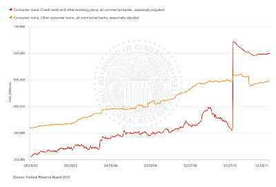
Does this look earth-shaking to you? The red line is the credit cards (revolving). The amber/yellow line is other consumer non-RE, and it includes car loans and student loans, which are eventually offloaded to government. The shift into slight growth has been going on for months, but nothing much is accelerating here.
The main difference between consumer credit (G.19) and consumer credit (H.8) is that consumer credit G.19 includes other sources of financing, including the federal government, finance companies and such riff-raff. Credit cards are mostly issued under the umbrella of national banks, because national banks have immunity from state lending laws, so there isn't a whole lot of CC's in finance companies and the like. Therefore H.8 shows you what is happening with CC lending, and it ain't what the Bloomberg story says.
The real story here is that credit-worthy consumers are using credit cards as a payment mechanism - they seem to charge and pay off. November showed a surge just because of the timing - consumers had started holiday shopping and didn't get their bills yet. Car loans continue to rise because consumers are buying cars at a higher rate, but if you look at G.19 non-revolving, you see that the category rose 8.3 billion, and 6.4 billion of that was to the federal government. So it's still mostly student loans.
What's interesting about 2012 holiday purchasing is Other Deposits in H.8:

The strong implication is that consumers are still being very careful about credit. Another strong implication is that restoring the FICA payroll tax will cause a downshift in consumer spending, as will drops in real incomes induced from other causes.
By now almost everyone realizes that a lot of the tuition loans are not going to be paid back. Still, the total keeps rising, and before hyperventilating over US consumer largesse, it's wise to look at the detail.
Over the course of 2011, there were several spates of stories about how consumers were borrowing more with their credit cards. But they aren't - not in a real sense. Consumers buy gas, and when gas prices go up, the monthly totals seem to jump - but their balances don't rise over time. A lot of consumers pay for winter heating bills with CCs, but again, they seem to be paying them off. Consumers pay for food with CCs, so the monthly totals seemed to rise as YoY food at home inflation hit 6% - but again, card balances don't rise much. In a "real" sense, they are still dropping.
Financial types should be dealing with the consumers we've got rather than the consumer of fantasy. We've got some consumers who are doing well, but it appears they don't feel like wasting their money on CC interest. If you save at 1% and borrow at 7%, paying off your CCs provides a much better return on your money, and then if you get into trouble you can always use the CC. This provides very little return for CC companies who let needy consumers run up their CC's much, which is how we get those high interest rates reported on G.19.
The Fed has created a situation in which the rewards for saving money even without a return are extremely high - probably the highest they've been in over 30 years. Having a substantial downpayment on your first home, or paying down your mortgage to refinance, gives you a very strong payback right now. Casual borrowing is remarkably expensive, and costs of living are rising.
This is a state change compared to the last 25 years, though. It appears persistent, and it will mean that the US consumer economy will be more sensitive to changes in real incomes than it has been for almost 30 years. That's the real lesson consumer credit is imparting, and it is one that policy-makers and WS types need to absorb.
Since we are on the topic of real incomes, here's some data from Table 2.1 of BEA GDP releases, extending through third quarter 2011:
This is real personal income disposable (taxes deducted), excluding personal transfer receipts. We recovered for a while after the recession ended, but we got hit again last quarter. If we restore FICA taxes, this will go down almost 2%.
This is the percent change in real disposable personal income. As you can see, the recent trend has not been our friend, and that includes the FICA tax cut. This graph would look much uglier without it.


This last is per capita real disposable income, including personal current transfers (welfare, SS, food stamps, Medicare, unemployment) and the FICA tax cuts.

It's not trending the right way either.
These graphs explain a lot about why Americans are continuing to save. They have to do so. The standard of living continues to decline, and any US fiscal adjustment will show up immediately in the consumer economy.
With the FICA tax cuts, the US abandoned any pretense of fiscal responsibility - but in just a few years, Mr. Market will begin to impose fiscal responsibility. The reason why the economy seems so confusingly weak is just that Americans have abandoned the borrowing habits of the last few decades, which suddenly returned us to demographic growth patterns.
When we have to endure fiscal adjustment, which is going to hit in just a few years, the consumer side of the economy will take another big hit, because right now the federal government is compensating for the money that Americans aren't personally borrowing by borrowing and giving money to Americans to spend. Eventually, we will have to shift to mostly taxing and giving money to Americans to spend, and that's when things suddenly get real. By then Americans will have built a little more cushion from their personal austerity regimes, but this is a long slow consolidation process, and the effect is greatly magnified by demographics.
Q1 Isn't Looking That Great
A lot of the December establishment gains looked very seasonal. NFIB claims that small businesses didn't have a great December job-wise (we'll get the full NFIB report tomorrow):
“Unfortunately, December’s jobs numbers fizzled, with the net change in employment per firm turning negative again; small businesses lost an average .15 workers per firm. Seasonally adjusted, 13 percent of the owners added an average of 2.6 workers per firm over the past few months, and 12 percent reduced employment an average of 3.5 workers per firm. However, the majority of owners (75 percent) made no net change in employment. Forty-five percent of owners hired or tried to hire in the past 3 months, but 34 percent of them reported few or no qualified applicants for the position(s).I'm guessing that the establishment data was biased a bit upward on the "winners" effect. Still, the jobs trend for small businesses retains some underlying positives. If fuel goes up very much those may be undercut, and I do believe housing will be a net positive for the US in 2012, although the situation will be quite spotty across the country.
I am pretty positive on US Treasuries for most of 2012. The Euro problems are snowballing a bit, although the "unlimited money" policy of the ECB is helping the marginal countries. But the Greek issue can't be deferred much longer - as Spiegel acknowledges, the latest plan to end all plans is essentially ludicrous:
A study by economist Henning Klodt of the Kiel Institute for the World Economy shows how unrealistic the troika's assumption was. Klodt calculates the amount by which current revenues must exceed expenditures in the Greek budget to get the country's debt under control. He concludes that even if there are significantly lower interest rates combined with very optimistic assumptions about the economy, the surplus would have to amount to more than 10 percent of GDP -- a value that, as Klodt notes, not a single industrialized country has ever achieved in recent decades.Spiegel's article calls the troika "dishonest". Perhaps a more tactful way to phrase it would be "almost infinitely unrealistic". This year it looks like push comes to shove on that issue very quickly. The backroom attempts to mitigate the situation all require private creditors to take huge cuts now - something on the order of 75 to 90% - but even that may not do it. Greek debt needs to be about halved. Therefore there is really not much of an incentive for the private creditors to accept what is being shoved down their throats by the nomenklatura, and they are balking.
Italy's 10 year remains at 7% or thereabouts. There is some relief on the short-term bonds, because the ECB is throwing money with a three-year timeframe. But the 5-year remains over 6%, and that three-year deadline poses problems of its own. The two-year is sticking around 5% currently. This year Italy has to refinance a lot of debt, and Italy appears to be in recession. It seems clear that Italy has no path toward cutting debt/GDP ratios this year, because how ever much it cuts, the increase on bond payments is going to put it under. At the end of this article you'll find a table with 2012 scheduled issues (computed privately).
The first hit for Italy came in 2008, when buyers got nervous. The government fought that one off, but how much further can they go? The thrown-money gambit has been more successful for Spain, but Spain does not have that much accumulated debt.
The story for this year with regard to Europe will be at best a series of continued marginal impacts, with several possible shocks greatly shifting the picture to the worse. If Ireland cannot continue with marginal growth it becomes a problem. The Iranian controversy has the possibility of shifting Europe into a deeper recession, most especially in Italy and Spain. Spain will have another traumatized year, and the Spanish people have probably had about enough by now. France is quite marginal, and faces a credit downgrade.
The UK is profiting, and should hang out in decent territory all year. It faces no problem with its bonds, and is helped by the uglies elsewhere. Japan has a day of reckoning coming, but need not face that day this year. The major problem for Japan is China. Ireland is probably going to wander stoically through the battlefields this year.
However 2012 is iffy, with the high probability of global growth impetus slowly walking down. You can see the problem in JPM's Global Combined PMI. We begin on a cheery note for December
At 53.0 in December, up further from October's 27-month low of 51.4, the JPMorgan Global All-Industry Output Index rose to a nine-month high. Growth of global economic activity has now been sustained for almost two-and-a-half years.How lovely. How did that happen?
The main factor driving the faster rate of global economic expansion in December was the US, where growth of all-industry activity hit a nine-month peak.Gives you a crestfallen feeling, doesn't it? This is true, but the US economy isn't strong enough to carry that load internally, and it needs external growth to continue to keep treading this path. I recommend looking at the link and the graph - world economic growth is occurring, but at an historically low rate. Any global economic factor that serves as a correlating vector is capable of taking this puppy down. Thus I would assume that there is much discussion over Iran right now in various international capitals.
One major factor that may take this down is simply commodity speculation. The money being thrown in Europe to banks is not going to circulate much, it appears. But a lot of that money is going to pay off maturing debts banks owed to other parties, and that money paid back to those creditors has to go somewhere. I figure that it will go into commodities at about a 2/3rds split until the thing gets to be a farce. I figure we already channeled 200 billion Euros into commodities, and the ECB is still handing out the Secret Santa bags. I don't think we can sustain 500 billion Euros added to commodities, and maybe considerably less.
I have a link to a paper on commodities and futures markets for you. Commodities markets are like other markets - none of them sustain big new amounts of money without price distortions. In the absence of that factor they tend to work pretty decently, as long as the markets are open (disclosed) and actively traded by parties with a multiplicity of interests. But a surge of money induces a reliable upward swing in prices. I do not believe there is any possibility that a lot of the extra Euros won't end up in commodities. There is no way that world bond markets can absorb it, and money has tended to walk out of the great China Attractor lately. Where else can it go?
If the Fed tries another QE, the results might be quite literally explosive. I don't think the Fed will - I think the Fed will concentrate on controlling pricing for bonds.
Saturday, January 07, 2012
Is Employment Really Improving?

This comes from St. Louis Fed Fred, of course.
The thick green line is core employment level (right axis). In other words, the number of persons aged 25-54 who are employed.
Such persons are the least likely to be disabled or retired, and most have finished their schooling.
The sustained drop in this measure of absolute jobs cannot be accounted for by retirements, because very few in this age bracket are retired.
The thinner blue and red lines (left axis) are labor force participations for men and women of all ages. Unfortunately, participating in the labor force doesn't mean you have a job - it means you are either working or looking for work. Those rates should be slightly affected downward by retirements.
I look at this green line, and I think that the happy talk is missing the mark completely. We're not gaining much.
Here's the same thing with a bit more slices on the ages:

The bottommost line is 55 and over employment, which has been increasing. This is easily explained by older people working longer - 22% of those aged 65 and up are still working. If you turned 65 last year, you have to wait until 66 for full retirement, so it's not surprising. Also a lot of retired people are unable to make ends meet and are working part-time, if they can.
The top blue line is just full-time workers. Note that we are having trouble climbing back on that measure as well.
The red line second from the bottom is 45-54 workers, which has declined a little but not much. This means that the 25-45 bracket has sustained huge job losses without recovery as a result of the Truly Bad Recession That Is More Like A Depression, henceforth to be referred to with the acronym TBRTIMLAD. There is nothing "great" about what we are experiencing.
You can't explain this by demographic movements - here are US population pyramids for 2006 and 2011:


The really big 2006 bracke between 45-49 moved in the 50-54 bracket.
The lower age brackets increased more than is immediately obvious, due to immigration and a move up of a larger group that were 20-24 in 2006.
The bottom line is that the young are seeing vicious levels of unemployment, which has a huge amount of impact on the future economy.
I really wonder what younger people are thinking as they wander around trying to deal with this. I don't think Obama can get reelected without their votes, but an increasing number of younger people must be desperate.
Update: Adding a new series to show just how rough it really is for so many out there:

One of the aspects of this that seems to be masking a real problem is higher employment among those of retirement age:

We've gained close to a million jobs right there.

Which is most of the gains for the 25 and older population? Aggh. Uggh. Gut punch.
Friday, January 06, 2012
Odd, Very Odd
I cannot yet make heads nor tails out of the US employment report, but it looks like we have trouble ahead. If you look at government jobs on Table B-1 vs. government jobs on Table A-8 you can see the difficulty. Table A-8 (household survey) has seasonally adjusted private sector jobs dropping and seasonally adjusted private sector jobs rising. Not good. Table B-1 shows the opposite.
Embrace the error bars! Confusing data means something.
In December, the seasonal adjustment factors are updated, which you can read at the end of this link to
You absolutely cannot explain the disparity on the Birth-Death adjustment for the Establishment survey - if anything, it works the other way. The B-D number is negative for December, which I believe to be substantially wrong.
On the other hand, ISM services showed marginally dropping employment.
After looking at petroleum, especially gas, I think that the establishment report is showing the winner-take-all effect, and a much stronger seasonal effect on changing shopping patterns. Unless the petroleum reports are FUBAR, which I have no reason to believe, Americans are shopping online a whole lot more.
The temporary gains in courier and messenger (42.2 thousand) and about 18K of the retail gains are going to drop right out. They are not "real". The real gain in construction will reach its low in the first quarter. Auto manufacturing has probably come close to peak, and won't add much if anything in the first quarter. The big add in accommodation and food services, almost all of which was in restaurants, is probably going to retract a bit. Temporary help services fell considerably, which is not that favorable a reading, but is consistent with much else.
My first hunch is that the variance between government jobs in the establishment survey and in the household survey is probably closer to the reality in the household survey; I'm basing that on samples of advertising.
Over the course of the year, most of the differences between the two surveys are inconsiderable. We have gained between 1.5 to 1.6 million private sector jobs. This is much better than losing jobs, but barring the retirements of boomers, it does little to correct the employment gap, because the civilian non-institutional population grew by almost 1.7 million. But the civilian labor force grew by less than 300,000 over the course of the year, because the boomers are aging and retiring - the not-in-labor-force number grew by more than 1.4 million.
So we do have a slowly improving economy, combined with dropping or stagnant real incomes for probably about 50% of households. One completely depressing statistic is that over the course of the year, the unemployment rate for blacks did not change at all. Last December it was 15.8%, and this December it is 15.8%. As you would expect, part-time for economic reasons fell hard in December, but that is going to reverse.
If fuel costs rise sharply, the odds of the US going into a longer downturn this year rise sharply. This is rather tightly balanced income-wise, and I have already figured in the FICA tax cut and the COLAs for retirement/disability. I am counting on the warmer winter weather boosting GDP by about 0.3-0.4% in the first quarter, annualized.
The major wild card I see over the first quarter are commodity prices. The ECB is throwing money. Banks are putting the excess money back on deposit at the ECB. However the non-excess is going to pay off bank loans, and a good chunk of that money is going to find its way into commodities. Should fuel prices rise much more, it will shave 0.3% at least from GDP. That would be quite bad.
Thursday, January 05, 2012
ADP Employment For December
If you go to the link and go to Chart 4, you'll see one of the trends I have been watching. Construction employment has taken its first strongly positive hop since this whole thing started in 07. This marks a state-change for the US economy which I believe keeps us out of frank recession in 2012 - unless, that is, the authorities do something idiotic.
Now there is one caveat on this - the weather is such that I would expect seasonally-adjusted construction employment to show up as higher than normal regardless, but another fact is that the jobs can't show up if the work isn't there.
Another positive in this report is found in Chart 1, which tracks employment in goods-producing industries, which has now exceeded its post-recession previous high. It's nothing hugely expansionary, but the US is still hauling hod on this one, and it is hugely important. Autos are doing well, and from freight data I am convinced that both the goods numbers and the construction numbers are real.
Tuesday, January 03, 2012
Singapore, Not So Good
3 January 2012. The pace of growth of the Singapore economy eased in the fourth quarter of 2011. According to advance estimates1, the economy grew by 3.6 per cent on a year-on-year basis in the fourth quarter of 2011, compared to the 5.9 per cent growth in the third quarter. On a seasonally-adjusted quarter-on-quarter annualised basis, the economy contracted by 4.9 per cent, following the 1.5 per cent gain in the previous quarter.Singapore tends to expand and contract pretty intensely, but still this result is disappointing. The three quarter trajectory is now -5.9% -> +1.5% -> -4.9%. If you are wondering how you get YoY growth out of that, Q1 was 26.6%. Let's just say there was a state change in the economy. The advance estimate for Q4 manufacturing is -21.7%, which is only marginally better than Q2's -22.3%.
China is clearly still slowing, as are South Korea, Taiwan and probably Japan. Brazil might be coming off the bottom, and India revived, but Europe's Eastern bloc is developing real holes. Markit PMIs. JPM Morgan Global Mfrg PMI shows us pretty much at a standstill. Europe is really not helping.
From here on in it is a battle of attrition, and if fuel prices rise that will pretty much take the thing out. The significance of the flat quarter may be less investment in plants, which cuts into another level of manufacturing and will probably hurt Japan and Germany. It won't help the US either.
It kind of looks like more drag than lift at this point, but we'll have to see what replacement orders go through for holiday sales. Maybe the optimism will do it, but probably not. I have a hunch based on inventories that we are looking at a two-month lift, but overall this seems to be weaker than I thought. The thing about inventories is that they are sensitive, so what looks like controlled inventories can change into overstocking surprisingly quickly in a lot of industries.
![]()
