 MaxedOutMama
Tuesday, August 31, 2010
Why Monetary Stimulus Is Needed
So far, the retail surveys show constrained activity but not contracting activity. The best way to describe this whole thing is that on the consumer side, we have generated a Christmas Club economy. That means consumer-side pricing for the basics will be very sensitive.
Chicago PMI: Under the circumstances, this is a very strong report. It shows slowing activity but also continued growth at a nice level that should tend to provide some bottom-level push up in the economy. The headline was 56.7 (aggregate indicator). That is well above the 40 year median, although this month production did drop below the median. Order backlogs and employment are way above the median, which suggests continued health for months. Prices paid are well below the median, although some of the comments received suggest that manufacturing will be price-sensitive as well.
And that is good, because the bid/cover on four week T-bills was 4.02, on three month T-bills it was a staggering 4.95, and on six month bills it was 4.18. And you know what that means - it means that buying is concentrated on end-of-quarter and end-of-year needs, and probably a lot of the buying is from banks. Maybe a lot of demand overseas. German bunds are hot also, and the rising yields for the riskier European stuff certainly might make European banks buy the stables. But to the extent that it is domestic, it certainly implies that banks will tend to be pulling money out of the economy rather than inserting money into the economy.
State Street's investor confidence survey fell again. The Conference Board's consumer confidence index showed an uptick from July, but is still at 53.5, which is not only very low historically, but is in fact below the year-ago level. The current situation assessment as 24.9 fell significantly from July's 26.4. Again, these levels demonstrate both price concerns and employment concerns. The future expectations are all that is holding this thing up, and the problem is that those expectations will be modified by experience.
Again, the negative assessment of current conditions is concerning given gas prices. See TWIP (This Week In Petroleum). Current gas prices are near year-over-year parity, and diesel is not up that much YoY. Stocks of finished product are running extremely high, though, except for propane which is solidly in the middle of the average range. And crude stocks continue well above the average range. There is very little pricing support for this market, but refining margins are quite restrained. See the two pump graphs at the right on this page.
The grocery business is suffering an extremely tight pricing environment. This is pretty much the case everywhere except for extreme high-end. I direct you to Lempert's commentary on the spread between retail food prices and wholesale food prices. And this brings me to a fact which did not escape the attention of Brian Horey of Aurelian Management. I like Brian, because he literally sits down and goes through the reports and the financials.
The minute the GDP update came out, Brian emailed me about food's second quarter performance in GDP, which was, you guessed, negative. In fact, in real terms, food expenditures fell 5.7% (see Table 3 on page 7) And this brings us back to the first link in the paragraph above, which is about Winn-Dixie's 5.2% same-store sales drop. Winn-Dixie is really outperforming! Now, almost always such an indication will either correct of its own or, if it cannot correct, will produce a hard contraction within a year or two. Unfortunately the BEA doesn't report much in the way of the differences I track, but it is easy to see from the detailed NIPA tables how close a correspondence between the economy and food sales there is.
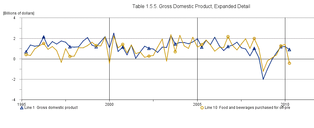
Okay, you knew you weren't going to escape the graphs. These are percent changes for GDP and the food purchased for off-premises consumption.
Chained Dollar, Recent:

Current dollar, recent:

Current dollar, the long view:

Based on food alone, we have entered the next contraction. Normally freight and so forth would have to correspond, but the truth is that we are not in a normal period. We are in a depression-like period. Anyway, this is what Who Struck John (it was reality that whapped him, apparently), who is in the food business, has been seeing and recounting to us.
Now, usually a substantial period of declines in the slopes for food will predict a recession. Sometimes that will be offset by another environmental economic change, such as monetary/rate stimulus, which produces a favorable cycle by shoving more money into people's pockets with which to buy food.
Or, as in 2005, people can just respond by borrowing tons of money. But obviously the ability to keep borrowing is limited, so sooner or later that catches up with you.
And this is the explanation for why I had to hit Barro with a club yesterday. An economics which is not concerned with the fact that the population is having trouble feeding itself is an idiotic economics doomed to fail. The reason why food sales dropped on a nominal basis in Q2 was that many people lost their unemployment benefits, and the jobs weren't there to replace incomes.
It will be difficult to craft policy responses sufficient to overcome this, although the recent extension of both the qualification dates for the tiers and the qualification dates for the initial unemployment (gets you on the ladder) will help.
Next we go back to monetary stimulus, hopefully with a bit of reality imprinted in our brains. I am not even going to take up Kocherlakota's speech, which Saloner described accurately as "Another genius that misses the economic wood for the mathematical tree."
Chicago PMI: Under the circumstances, this is a very strong report. It shows slowing activity but also continued growth at a nice level that should tend to provide some bottom-level push up in the economy. The headline was 56.7 (aggregate indicator). That is well above the 40 year median, although this month production did drop below the median. Order backlogs and employment are way above the median, which suggests continued health for months. Prices paid are well below the median, although some of the comments received suggest that manufacturing will be price-sensitive as well.
And that is good, because the bid/cover on four week T-bills was 4.02, on three month T-bills it was a staggering 4.95, and on six month bills it was 4.18. And you know what that means - it means that buying is concentrated on end-of-quarter and end-of-year needs, and probably a lot of the buying is from banks. Maybe a lot of demand overseas. German bunds are hot also, and the rising yields for the riskier European stuff certainly might make European banks buy the stables. But to the extent that it is domestic, it certainly implies that banks will tend to be pulling money out of the economy rather than inserting money into the economy.
State Street's investor confidence survey fell again. The Conference Board's consumer confidence index showed an uptick from July, but is still at 53.5, which is not only very low historically, but is in fact below the year-ago level. The current situation assessment as 24.9 fell significantly from July's 26.4. Again, these levels demonstrate both price concerns and employment concerns. The future expectations are all that is holding this thing up, and the problem is that those expectations will be modified by experience.
Again, the negative assessment of current conditions is concerning given gas prices. See TWIP (This Week In Petroleum). Current gas prices are near year-over-year parity, and diesel is not up that much YoY. Stocks of finished product are running extremely high, though, except for propane which is solidly in the middle of the average range. And crude stocks continue well above the average range. There is very little pricing support for this market, but refining margins are quite restrained. See the two pump graphs at the right on this page.
The grocery business is suffering an extremely tight pricing environment. This is pretty much the case everywhere except for extreme high-end. I direct you to Lempert's commentary on the spread between retail food prices and wholesale food prices. And this brings me to a fact which did not escape the attention of Brian Horey of Aurelian Management. I like Brian, because he literally sits down and goes through the reports and the financials.
The minute the GDP update came out, Brian emailed me about food's second quarter performance in GDP, which was, you guessed, negative. In fact, in real terms, food expenditures fell 5.7% (see Table 3 on page 7) And this brings us back to the first link in the paragraph above, which is about Winn-Dixie's 5.2% same-store sales drop. Winn-Dixie is really outperforming! Now, almost always such an indication will either correct of its own or, if it cannot correct, will produce a hard contraction within a year or two. Unfortunately the BEA doesn't report much in the way of the differences I track, but it is easy to see from the detailed NIPA tables how close a correspondence between the economy and food sales there is.
Okay, you knew you weren't going to escape the graphs. These are percent changes for GDP and the food purchased for off-premises consumption.
Chained Dollar, Recent:

Current dollar, recent:
Current dollar, the long view:

Based on food alone, we have entered the next contraction. Normally freight and so forth would have to correspond, but the truth is that we are not in a normal period. We are in a depression-like period. Anyway, this is what Who Struck John (it was reality that whapped him, apparently), who is in the food business, has been seeing and recounting to us.
Now, usually a substantial period of declines in the slopes for food will predict a recession. Sometimes that will be offset by another environmental economic change, such as monetary/rate stimulus, which produces a favorable cycle by shoving more money into people's pockets with which to buy food.
Or, as in 2005, people can just respond by borrowing tons of money. But obviously the ability to keep borrowing is limited, so sooner or later that catches up with you.
And this is the explanation for why I had to hit Barro with a club yesterday. An economics which is not concerned with the fact that the population is having trouble feeding itself is an idiotic economics doomed to fail. The reason why food sales dropped on a nominal basis in Q2 was that many people lost their unemployment benefits, and the jobs weren't there to replace incomes.
It will be difficult to craft policy responses sufficient to overcome this, although the recent extension of both the qualification dates for the tiers and the qualification dates for the initial unemployment (gets you on the ladder) will help.
Next we go back to monetary stimulus, hopefully with a bit of reality imprinted in our brains. I am not even going to take up Kocherlakota's speech, which Saloner described accurately as "Another genius that misses the economic wood for the mathematical tree."
Monday, August 30, 2010
Just What The Economy Needed
A hurricane named Earl. Currently Cat 4 and expected to turn up the east coast.
Current forecasts don't have much probability of US coastal hurricane wind impacts except, of course, for the usual recidivists such as NC, but if you look at the tropical wind forecast, one has to wonder if it is really wise to be at the beach on much of the east coast this Labor Day weekend.
Thursday afternoon Earl is supposed to be plowing toward North Carolina, which is one of the places that stands a decent chance of hurricane force winds. And there is some chance of tropical-force winds moving inland over WVA, Maryland, Deleware and even well into Pennsylvania this weekend. So I'm thinking hanging out at the beach might not be such a good idea. This surely can't be great news for the coastal communities.
Who named this sucker anyway? If they just had tagged it with a handle like "Ernest" or "Elgin" or "Eddie" I'm sure this one would be behaving more like Danielle. But "Earl"?? Earl sounds like some guy you don't want to meet in an alley in back of the bar. Earl sounds like a bruiser who hangs out at the bar tearing up phone books for free beer. Earl the hurricane appears to be living up to the connotations of his name.
From now on, we need to get the hurricane people to put only wussy names in the queue. And as many of those names as possible should be French for extra safety margin.
The next one is "Fiona", which is also a bad pick. "Fiona" is Irish, and she's probably a red-head with a normally bad temper PMSing. Why not "Felice" or "Fanny"?
Better yet, we should change the whole scheme and make sure they all have dog names. That way they'd just bound up and lick your face a bit, shed, and then go off to chase ball. See, "Fido" would be a really good name for a hurricane.
Robert Barro, Ivy League Retardation Demo Case
Who is Robert Barro and why has he published an article in the Wall Street Journal entitled "The Folly of Subsidizing Unemployment"?
Who:
So how do I, the redneck cracker, dare to contradict the esteemed Barro? Well, read on and judge for yourself.
In the article, Herr Professor Doktor Physiker Barro compares the current recession to 1982, and contends that the cause of our current high unemployment is extended unemployment benefits. I'm not making this up:
 This is 1975-1985 total employed. Note that the impact of the 80/81 recessions is very evident. Total employment was quite flat from 1979 through the first half of 1983. The population was not. Hence, sorrow.
NBER has the 1981 recession ending in November of 1982. Employment is a lagging indicator, but it did begin to rebound very strongly in the spring of 1983.
 This is 2000-2010 (so far) total employed. That is quite a camel. Note that the current number of jobs is most comparable to the level in the first half of 2004. Hence, sorrow.
We're only one year away from the proverbial seven years of bad luck, kids. Six years of no net new jobs is a lot worse than four years.
Now most people not entitled to introduce themselves as Herr Professor Doktor Physiker (insert name here) would look at this and think, Gee, we have very high long term unemployment because we lost a staggering number of jobs, not because people are refusing to go out and get jobs.
Mr. Barro is quite correct that people will stay on unemployment longer if unemployment is offering them a higher level of income than any job they can find. And he is correct in observing that some European countries have produced a high level of structural unemployment by offering very generous unemployment benefits over a long term.
However it does not necessarily follow that in this case, extended unemployment benefits are causing long term unemployment. It rather looks as if long term unemployment is causing extended benefits.
To settle the argument experimentally, we would have to find a US population that gets no unemployment benefits, wouldn't we? And then we could compare unemployment in that population to unemployment in the population that gets extended unemployment benefits and see if people are behaving differently in the two populations.
Who'd 'a thunk? Apparently not the Ivy League! We have such a population in youngsters. There are young people graduating from high school, colleges and universities. Very few of the qualify for unemployment benefits, because even if they have been working since they were fourteen, their jobs are almost solely classed as temporary. You get this information from Table A-10 of the household survey, unless you are firmly ignoring any evidence which contradicts your hypothesis:
Unemployment rates 16-19 years:

Unemployment rates 20-24 years:


Unemployment rates 25-54 years
Unemployment rates 55-> years:

This is the reciprocal of what we would expect to see if Mr. Barro's hypothesis were true. By far the highest percentage of households with fixed income streams from non-employment fall in the 55 and over bracket. The persons in our economy who are least likely to have other income streams are teens and early twenties. Yet as you move up the age/assured income ladder, unemployment rates fall dramatically. We have over 25% unemployment among teens dropping to 7% unemployment in the 55 and over group.
The reason, of course, is that more experienced workers are pushing less experienced but more desperate workers out of jobs. This trend will continue, and in large part the growth of teen and early twenties unemployment is because persons with some but inadequate retirement income have been supplementing their incomes by taking jobs that do not pay a living wage away from younger people. This trend was clearly evident even before the recession, and it is due in part to the change in the CPI calculation instituted in the late 1990s by the Clinton administration. This has slowly reduced Social Security benefits and the accumulated effect will persist even if the US economy were to rebound sharply.
It is worth closing this by reminding everyone of several elementss:
A) The household survey uses a very expansive definition of "employment". It's anything you do for pay. In the household survey, you can be counted as "employed" if you mowed someone's lawn for money once in the survey week, or if you spent a day collecting tin cans for sale to a salvage point. Such marginal "employment" is probably a larger percentage of those "employed" now than it was during the 1980s.
B) The demographics of the US population are very different than they were during the 80s. Retirements have cut the unemployment rate in the US during this cycle compared to the 80s. Unemployment would have peaked near 12% in this cycle if it were not for retirements.
C) The structural change involved in older workers pushing younger workers out of the employment pool will increase over the next two decades.
D) I am genuinely shocked that an individual with such resources who has done highly estimable work would go into print with such a shoddily researched claim.
In conclusion, I will post the same series of graphs for the years 1975-2010, so you can see that the differences pool at the ends of the age spectrum:

 16-19 years; 1975 to 2010. Note the much higher peak of youth unemployment.


20-24 Young adult 1975-2010. Very similar, although slightly higher at peak, in this cycle so far. Few in this age bracket qualify for unemployment benefits.
20-54 years. 1975-2010. Almost the same over the two bad recessions. In this bracket, most qualify for unemployment benefits, although over time the incidence of contract workers and self-employed who do not qualify has risen somewhat.
The unemployed geezers aged 55 and over from 1975 to 2010. Here, as in teens, you see a very significant difference. In part this is because far more geezers are seeking employment. A BLS write up on the older workforce from April of this year. Nice graphs. Too bad Barro didn't read it.
Who:
Robert J. Barro is Paul M. Warburg Professor of Economics at Harvard University, a senior fellow of the Hoover Institution of Stanford University, and a research associate of the National Bureau of Economic Research. He has a Ph.D. in economics from Harvard University and a B.S. in physics from Caltech. Barro is co-editor of Harvard’s Quarterly Journal of Economics and was recently President of the Western Economic Association and Vice President of the American Economic Association. He is honorary dean of the China Economics & Management Academy, Central University of Beijing. He was a viewpoint columnist for Business Week from 1998 to 2006 and a contributing editor of The Wall Street Journal from 1991 to 1998. He has written extensively on macroeconomics and economic growth. Noteworthy research includes empirical determinants of economic growth, economic effects of public debt and budget deficits, and the formation of monetary policy. Recent books include Macroeconomics: A Modern Approach from Thompson/Southwestern, Economic Growth (2nd edition, written with Xavier Sala-i-Martin), Nothing Is Sacred: Economic Ideas for the New Millennium, Determinants of Economic Growth, and Getting It Right: Markets and Choices in a Free Society, all from MIT Press. Current research focuses on two very different topics: the interplay between religion and political economy and the impact of rare disasters on asset markets.A very good resume, right? The physics degree had me whimpering and groaning. A physicist ought to be able to do better.
So how do I, the redneck cracker, dare to contradict the esteemed Barro? Well, read on and judge for yourself.
In the article, Herr Professor Doktor Physiker Barro compares the current recession to 1982, and contends that the cause of our current high unemployment is extended unemployment benefits. I'm not making this up:
To begin with a historical perspective, in the 1982 recession the peak unemployment rate of 10.8% in November-December 1982 corresponded to a mean duration of unemployment of 17.6 weeks and a share of long-term unemployment (those unemployed more than 26 weeks) of 20.4%. Long-term unemployment peaked later, in July 1983, when the unemployment rate had fallen to 9.4%. At that point, the mean duration of unemployment reached 21.2 weeks and the share of long-term unemployment was 24.5%. ... The peak unemployment rate of 10.1% in October 2009 corresponded to a mean duration of unemployment of 27.2 weeks and a share of long-term unemployment of 36%. The duration of unemployment peaked (thus far) at 35.2 weeks in June 2010, when the share of long-term unemployment in the total reached a remarkable 46.2%. These numbers are way above the ceilings of 21 weeks and 25% share applicable to previous post-World War II recessions. The dramatic expansion of unemployment-insurance eligibility to 99 weeks is almost surely the culprit. To get a rough quantitative estimate of the implications for the unemployment rate, suppose that the expansion of unemployment-insurance coverage to 99 weeks had not occurred and—I assume—the share of long-term unemployment had equaled the peak value of 24.5% observed in July 1983. Then, if the number of unemployed 26 weeks or less in June 2010 had still equaled the observed value of 7.9 million, the total number of unemployed would have been 10.4 million rather than 14.6 million. If the labor force still equaled the observed value (153.7 million), the unemployment rate would have been 6.8% rather than 9.5%.All of the quoted figures seem to be correct or close to correct, but there is one aspect of this situation that Barro seems to have overlooked from his ivory tower. To explain, I will use BLS data from the household survey (get it here by selecting seasonally adjusted Employed ):
 This is 1975-1985 total employed. Note that the impact of the 80/81 recessions is very evident. Total employment was quite flat from 1979 through the first half of 1983. The population was not. Hence, sorrow.
NBER has the 1981 recession ending in November of 1982. Employment is a lagging indicator, but it did begin to rebound very strongly in the spring of 1983.
 This is 2000-2010 (so far) total employed. That is quite a camel. Note that the current number of jobs is most comparable to the level in the first half of 2004. Hence, sorrow.
We're only one year away from the proverbial seven years of bad luck, kids. Six years of no net new jobs is a lot worse than four years.
Now most people not entitled to introduce themselves as Herr Professor Doktor Physiker (insert name here) would look at this and think, Gee, we have very high long term unemployment because we lost a staggering number of jobs, not because people are refusing to go out and get jobs.
Mr. Barro is quite correct that people will stay on unemployment longer if unemployment is offering them a higher level of income than any job they can find. And he is correct in observing that some European countries have produced a high level of structural unemployment by offering very generous unemployment benefits over a long term.
However it does not necessarily follow that in this case, extended unemployment benefits are causing long term unemployment. It rather looks as if long term unemployment is causing extended benefits.
To settle the argument experimentally, we would have to find a US population that gets no unemployment benefits, wouldn't we? And then we could compare unemployment in that population to unemployment in the population that gets extended unemployment benefits and see if people are behaving differently in the two populations.
Who'd 'a thunk? Apparently not the Ivy League! We have such a population in youngsters. There are young people graduating from high school, colleges and universities. Very few of the qualify for unemployment benefits, because even if they have been working since they were fourteen, their jobs are almost solely classed as temporary. You get this information from Table A-10 of the household survey, unless you are firmly ignoring any evidence which contradicts your hypothesis:
Unemployment rates 16-19 years:

Unemployment rates 20-24 years:


Unemployment rates 25-54 years
Unemployment rates 55-> years:

This is the reciprocal of what we would expect to see if Mr. Barro's hypothesis were true. By far the highest percentage of households with fixed income streams from non-employment fall in the 55 and over bracket. The persons in our economy who are least likely to have other income streams are teens and early twenties. Yet as you move up the age/assured income ladder, unemployment rates fall dramatically. We have over 25% unemployment among teens dropping to 7% unemployment in the 55 and over group.
The reason, of course, is that more experienced workers are pushing less experienced but more desperate workers out of jobs. This trend will continue, and in large part the growth of teen and early twenties unemployment is because persons with some but inadequate retirement income have been supplementing their incomes by taking jobs that do not pay a living wage away from younger people. This trend was clearly evident even before the recession, and it is due in part to the change in the CPI calculation instituted in the late 1990s by the Clinton administration. This has slowly reduced Social Security benefits and the accumulated effect will persist even if the US economy were to rebound sharply.
It is worth closing this by reminding everyone of several elementss:
A) The household survey uses a very expansive definition of "employment". It's anything you do for pay. In the household survey, you can be counted as "employed" if you mowed someone's lawn for money once in the survey week, or if you spent a day collecting tin cans for sale to a salvage point. Such marginal "employment" is probably a larger percentage of those "employed" now than it was during the 1980s.
B) The demographics of the US population are very different than they were during the 80s. Retirements have cut the unemployment rate in the US during this cycle compared to the 80s. Unemployment would have peaked near 12% in this cycle if it were not for retirements.
C) The structural change involved in older workers pushing younger workers out of the employment pool will increase over the next two decades.
D) I am genuinely shocked that an individual with such resources who has done highly estimable work would go into print with such a shoddily researched claim.
In conclusion, I will post the same series of graphs for the years 1975-2010, so you can see that the differences pool at the ends of the age spectrum:

 16-19 years; 1975 to 2010. Note the much higher peak of youth unemployment.

20-24 Young adult 1975-2010. Very similar, although slightly higher at peak, in this cycle so far. Few in this age bracket qualify for unemployment benefits.
20-54 years. 1975-2010. Almost the same over the two bad recessions. In this bracket, most qualify for unemployment benefits, although over time the incidence of contract workers and self-employed who do not qualify has risen somewhat.
The unemployed geezers aged 55 and over from 1975 to 2010. Here, as in teens, you see a very significant difference. In part this is because far more geezers are seeking employment. A BLS write up on the older workforce from April of this year. Nice graphs. Too bad Barro didn't read it.
Friday, August 27, 2010
Moneyness Technical Issues I: Reading
Technical Base Resources:
Fed Paper: Money, Reserves, and the Transmission of Monetary Policy: Does the Money Multiplier Exist.(2010 Carpenter and Demiralp)
Monetary Statistics of the United States: Estimates, Sources, Methods (1970 Friedman and Schwartz)
Introduction to Concepts:
The Fractional Reserve Banking system.

The Money Multiplier
Measuring Money:
{Oops - I did not mean to publish this yet. However, I'll leave it up. I am working on an answer to several technical questions, and a non-trivial response requires a discussion of money, money supply, and velocity}.
Fed Paper: Money, Reserves, and the Transmission of Monetary Policy: Does the Money Multiplier Exist.(2010 Carpenter and Demiralp)
Monetary Statistics of the United States: Estimates, Sources, Methods (1970 Friedman and Schwartz)
Introduction to Concepts:
The Fractional Reserve Banking system.
The Money Multiplier
Measuring Money:
{Oops - I did not mean to publish this yet. However, I'll leave it up. I am working on an answer to several technical questions, and a non-trivial response requires a discussion of money, money supply, and velocity}.
GDP Q2 2010 - It Could Be Worse
The headline number is 1.6% for Q2. The full release in pdf format is here.
It might be more instructive to look at BEA's NIPA table giving real GDP in current dollars. You can look at this table from 2006 to Q2 2010 here.
Note that the peak of real GDP in current dollars (according to current figures) was in Q4 2007 at 13,363 trillion. We are currently at 13,191 trillion. Both Q2 GDP and personal consumption are almost exactly at the level of Q2 2007.
The low for this cycle, as currently measured, occurred in Q2 2009 at 12.8 trillion.
Going back to Q2 2007, it's worth looking at the underlying details. At that time Gross Private Domestic Investment (the main driving force for economic expansion) was about 2.2 trillion. In Q2 2010, it is about 1.8 trillion. To get the same level of GDP, our net exports have risen about 250 billion (07 -.7 trillion, 10 -.45 trillion), and government spending has risen .14 trillion. This means that although we do not have the same level of credit shock pending, nor do we have the huge consumption/production drag of the massive rise in oil prices, we do have a somewhat weaker base for growth.
In particular, I am a little worried about private inventories. They have risen for two quarters. The huge increase in rail metals shipments makes me think they are due to rise again this quarter. This rise in private inventories will only be sustainable if consumption can rise fast enough to keep it rolling through. If consumption doesn't, then this will turn into a drag in Q4.
Even if we pegged US population growth at an average 0.5% the last three years, much lower than normal, the population should have increased by 4.5 million. Thus our per capita consumption is down, and this tends to suggest that our per capita consumption should rise.
The figures for private inventories and government spending will be revised again next month, so we'll have to wait to get a better read.
If you look at Table 10 in the current release, you'll see figures for personal income ex current transfer receipts (government payments to or on behalf of persons) at the bottom of the table. In 2007 the level was 9.66 trillion. Personal current transfer receipts were 1.72 trillion. In Q2 according to this release personal incomes ex current transfer receipts finally started to grow markedly, growing about 70 billion. The trough was in Q4 09 at 9.109 trillion. In Q1 we increased a hair at 9.111 billion. The Q2 level is reported at 9.181 trillion. HOWEVER, personal current transfer receipts increased from 2007's 1.72 trillion to 2.29 trillion in Q2 (annualized). This explains EVERYTHING about our current fiscal crisis.
The total of personal current taxes and contributions for government social insurance (payroll taxes) for Q2 was 2,131.5. This does not even add up to cover our government payments to individuals. Compare this to 2007's total of personal current taxes and contributions for government social insurance of 2,448.2 (2.45 trillion) and personal current transfer receipts of 1,718.5 (1.72 trillion). Mind you, we were running a total deficit then even with the .7 trillion excess. And now we've got a deficit.
As (and if) the economy slowly continues to improve tax receipts will rise, but even the rosiest forecasts show that personal current transfers will rise faster. Unemployment insurance and hopefully some other subsidies such as food stamps will drop, but the increase in retirements and medical payments will overcome that drop.
Thursday, August 26, 2010
Large US Banks - Unmitigated Asses Or So Amoral They Ought To Be Behind Bars?
I mentioned before that larger banks appeared to be clearing their loan loss reserves too quickly.
But seriously dude, take a look at Q2 Bank Charge Offs and Delinquencies. Delinquencies hit a new high at 7.32% SA. Charge offs dropped to 2.86%, but how much can that mean if delinquencies are still rising overall?
When you look at the details, your heart quails. After all, charge offs dropped 21 basis points on residential mortgages. That's pretty significant, and much better than the overall drop in charge offs of a measly six basis points. Now look at delinquencies for residential mortgages, and they rose 45 basis points to a shocking 11.40%. (1,140 basis points). Delinquencies on credit cards dropped 69 basis points, but charge offs rose to 10.66% from 10.07%.
It will take a while. Two graphs from the indispensable St Louis Fed Fred:

This is the ratio of loan loss reserve to total loans. The higher the expected charge off curve, the higher this ratio should be. The annualized charge off rate for Q2 was 2.86%. The height in this cycle was 2.93% in 09 Q4.
An annualized rate is equivalent to the rate if the current seasonally adjusted losses held for four quarters.
But the current charge off rate is less important than the delinquency rate plus experience. In the last really bad banking cycle (1991) the charge off rate peaked in 1991 Q2 at 1.70%, and the delinquency rate peaked at 1991 Q2 at 6.16%. Note that the charge off/delinquency ratio was about 28% then, but in Q2 2010 it was 39%. This is because far more homes are worth significantly less than the outstanding loans they are securing.
The real reason some banks think they can get away with this is because they dumped the risk for some of their worst mortgage loans onto the government. But I think they haven't entirely. I think that a lot of politicians are going to hit the streets and that there will be something of a day of reckoning when the GSEs come back to certain entities and hand them back their lovelies, the entities tromp off to their Congressional feeding trough, and get rebuffed.
Mortgages are huge chunk of the problem - when you look at interest rates earned versus accrued losses, it becomes clear why the charge off/delinquency ratio is so high this time. And the ability of banks to cover this from their current earnings has peaked - now we are in the era of declining net interest margins:

When your earnings come slow and hard, and your losses come hard and fast, you are operating in a high risk environment.
Note that banks were rolling along much better in 1991 and after, so they were far more able to recoup their losses.
Now, I am fascinated to note a sudden spate of articles suggesting that Fannie, Freddie and FHA (rarely named explicitly) should be shut down and the losses then covered by the government. This tends to exclude the "unmitigated asses" theory of US bankers, because doing so would protect these banks from the inevitable handbacks which must ensue after the last 18 months of handoffs to the GSEs.
It's important to reiterate this. Large US banks were deliberately taking their bad loans and rewriting them as GSE loans or FHA insured. Thus, they believe their only remaining problem is to make sure that these entities will not be able to come back to them and make rude noises such as "your appraisal value was wildly inflated - take it back!" And the means that they have chosen to accomplish this are the shutdown of these entities.
Full Disclosure: I currently have significant holdings of BofA and Citi stock, because I am hedging my theory that Congressional corruption is now nearly infinite based on the last year's performance. And I also note with sorrow that Barney Frank is on the "shut the GSEs down and stick the taxpayers with the bill" bandwagon. My investment in the criminality/stupidity/cupidity of Congress Critters plus the absolute inattention of the populace may pay off.
But it shouldn't! This is a huge fraud. My conclusion is that the executives of these organizations are so amoral that they should be behind bars.
Please, prove me wrong and make me poorer.
Initial Claims August 26
Update: The KC Fed survey contradicts my optimism in the rest of this post. The next Chicago PMI will be interesting indeed, as will NACM. End update.
Initial claims dropped to 473,000 compared to last week's initially reported 500,000. However last week's claims were revised up to 504,000. The four-week moving average for initial claims rose to 486,750. That is a bit intimidating.
However I feel more certain about my theory that a good chunk of the rise in these claims are related to education cuts, and thus that initial claims should tend to fall after mid September. Of course my theory could be totally wrong. The nice part is that we have to wait less than a month to find out! In this business, one rarely gets that type of rapid feedback. School calendars vary by almost a month across the country, and so you would expect to see a rise, a fall, and then perhaps a later rise, followed by a fall. And just 20-30K additional initial claims would make these numbers show a significant rise.
Also August's and September's employment reports will show whether most of the chop is coming in government. If it is, that is less of a recession indicator than it would be if the cuts were coming from the private sector.
So far on the freight indicators, trucking has been sagging all summer, but rail is continuing to power through. The rail figure really confirms Chicago PMI, which has held up mightily. For whatever reason, the Philly Fed survey tends to be much more correlated with new home activity, and so I'm slotting that one in as real, but due to another segment effect.
Now having written that, I want to remind everyone of a few less positive factors related to the weekly unemployment claims reports (all of which can be found here by selecting "news release"):
A) We began 2010 with a covered employment base of 130,128,328. The base is figured by using reports from the state payment records, and the base is only updated every few months. The last update was at the beginning of July, and we were down to a base of 126,763,245. In April, the intermediate figure was 129,298,468. This is a lagging indicator, in part because many companies send in these taxes quarterly.
B) Nonetheless, this is very close to the overall figures for BLS' household survey in the employment report. If you look at those figures, they show that the majority of the gains in employment in the March-May segment appeared to be from Census, and they dropped right out again in June and July. YoY, the number of unemployed had not changed in July. This is stressful, because over that same period millions had gone on retirement, which should have shifted the unemployed number down somewhat if all other things had been equal.
C) The numbers for insured unemployment taken YoY demonstrate the painful situation:
Year: 2009............................2010
Initial: 5.7 million....................4.2 million
Ext B: 0.62 million..................0.93 million
EUC: 3.0 million....................4.9 million
Total: 9.3 million..................10.0 million
There are, however, more persons who fell off the insured unemployment wagon and who aren't shown. So like it or not, we cannot discard the initial claims as a pure flier. They may not be indicative of the employment market as a whole (or they may be), but in a labor market which has shown such severe weakness, any additional segment weakness cannot be airily dismissed.
When trying to check confusing indicators, one of the first recourses for any economy is to go to fuel and energy consumption. Like it or not, this is an indicator of overall activity in any economy. And looking at the last crude inventories report (pdf) does not really support the idea that the overall economy is weakening much. It's definitely not booming, but four-week gasoline consumption is up by 3% YoY and diesel consumption is still up 4.9% YoY. Although the growth in diesel demand YoY is much less than reported earlier in the year, in part that is because consumption patterns later in 2009 were higher. You can use these figures to make a case that the economy is sagging slightly from its performance a few months ago, but that is all. One can also argue that efficiency adjustments mean that these numbers indicate that the economy is growing slightly from its activity levels a few months ago.
We certainly do have plenty of petroleum product out there, and end-user prices are sagging because of that.
Another place to check energy consumption is the industrial production report. The last one is for July, and it shows that YoY utility output was up 8.2%, very correlated with the YoY increase in overall production of 7.7%.
Therefore I really don't see, at this time, that there is a strong case for a big contraction in real growth. However, the reality is that real growth has been very constrained over this "recovery" cycle, and a very minor retraction could push us into an additional mild contraction. Because of this, consumer buying power and spending will be all important over the next year.
So next up, incomes, ready money, and retail prospects.
Wednesday, August 25, 2010
Gurgle, Snicker
New home sales full report, but why would you read it? The chart tells the story:

The rhetoric does not tell the story about the real level. This is world limbo champion low. Don't worry - China is going to try to beat us on this curve. I'm not sure whether they can, but I am sure they are going to try!
Durables wasn't really bad at all, but WS is in one of its periodic screaming-crying-running frenzies. They have been for the last month, because the response to Iran's nuclear announcements and desert fireworks was "Omigod! I better sell oil quick before it goes even lower!" And those who followed that logic are in fact very glad they did. We have a genuine glut of oil and finished products. Part of the problem is that once again, the forecast end-of-the-gulf-world-via-hurricane has not materialized.
They laughed at me years ago when I said this would end up being multi-year recession and close to double-digit. They asked "What does a dumb-ass cracker from GA know?" They ain't laughing no more. NBER is not going to be declaring an end to this recession this year.
I do have some relatively good news, though. ( If we want to face up to reality and do what works.) I am working on some graphs to explain. It's sure not good news for China, though. The income cycle, which I track, is six months to a year ahead of the GDP cycle at a minimum. And I still have decent income trends. Plus, the current Wall Street running-with-knives bit is going to help producers a bit and help average consumers a bit. Financial bonuses - not so much. That's why they're running and screaming.
Tuesday, August 24, 2010
I Crashed The US Treasury Server
I was downloading a bunch of Monthly Statements in pdf format, and the thing just went down and won't come up.
So, does this link work for you? If not, I guess they decided that I"m trying to mount a DoS attack, which is ridiculous, but I have had similar problems before with Treasury. I used to have a program that downloaded them, but I had to stop using it because they get hysterical if you download a bunch of files in succession.
I have a messed up extract file and I need to rebuild it to check it, and my backup is too old (the good copy - I have a recent copy, but it is messed up too).
If I have to use a proxy to get US tax data, I'm going to be really, really mad. And my shoulder still hurts, so I really don't need this tonight.
Laughing
Go over to Calculated Risk for a full discussion of existing home sales.
What has me laughing is this summary from the Bloomberg economic calendar:
I do want to remind everyone that this is neither unexpected or unpredictable. CR predicted the over-12 months and the much lower sales than the "expectation". The difference is between Wall Street economists and working economists.
However the Fed will now go into another round of injecting money into the market, which will only shove the dollar down. Over time, the Fed needs the dollar to stay low, because by doing so they hope to stimulate exports. However to really leverage the low dollar, the US would need a much better energy policy which would provide reliable energy at relatively low cost.
I still can barely move my left arm, and typing is very painful. So I would like to write more, but for now I will refer you to this article published last Friday by the Philly Fed on economic returns from housing. This is a very understandable article for the non-economists among us.
The authors have missed a few points about why buying primary residences works for some lower income population groups, but they have pegged the real return correctly:
The controlling factor for home prices in the long run are incomes in the home-buying cohort and the size of that cohort. Incomes control long-term home prices by setting rents in the marketplace, which sets rates of return for investment housing.
Over the next 20 years, both the size of the home-owning/homebuying cohort will drop and average incomes will drop in the rental market. So nationally, home prices have considerable declines built-in.
I figure that the federal government just wasted from 300-400 billion of taxpayer money in a futile attempt to shore up the unshoreable. And they're defending this as a good policy!
PS: The price calculations in this report (it was reported that median price rose) are meaningless. You have to look at single-family vs condo sales in at least each market to see what is going on. In most of the nation, single-family housing costs more on average than condos. In some areas of high density, the reverse is true. And a great deal of reported home price valuations is based on the change in the mix. That's one factor. Another factor is that the housing tax credit temporarily scraped out lower-level entry buyers, so you tend to get a slightly more affluent set of buyers in the market now. You get the breakouts by region and housing type here at NAR's Existing home sales data page.
What has me laughing is this summary from the Bloomberg economic calendar:
It doesn't get worse than this. Existing home sales fell 27.2 percent in July to a 3.83 million annual rate for the lowest level in 15 years. The 3.83 million rate compares with expectations for 4.65 million. Supply at the current sales rate ballooned from June's already swollen 8.9 months to 12.5 months for the worst reading in 11 years.Sadly, the only inaccurate statement above is "it doesn't get worse than this". It does when home prices collapse again and the taxpayers get to foot the bill for all the government-guaranteed home mortgages written over the two years SINCE the original collapse.
I do want to remind everyone that this is neither unexpected or unpredictable. CR predicted the over-12 months and the much lower sales than the "expectation". The difference is between Wall Street economists and working economists.
However the Fed will now go into another round of injecting money into the market, which will only shove the dollar down. Over time, the Fed needs the dollar to stay low, because by doing so they hope to stimulate exports. However to really leverage the low dollar, the US would need a much better energy policy which would provide reliable energy at relatively low cost.
I still can barely move my left arm, and typing is very painful. So I would like to write more, but for now I will refer you to this article published last Friday by the Philly Fed on economic returns from housing. This is a very understandable article for the non-economists among us.
The authors have missed a few points about why buying primary residences works for some lower income population groups, but they have pegged the real return correctly:
Assuming an annual depreciation rate of 2.5 percent, a property tax rate of 1.5 percent, a mortgage interest rate of 7 percent, and a marginal income tax rate of 25 percent for a typical taxpayer, the adjusted real rate of return on housing actually falls below zero (1.3-2.5-1.5+0.25(7+1.5))=-0.575 percent!The 1.3% is the real rate of home price appreciation nationally. It was only the expectation of really high rates of return that made buying multiple houses seem like a really great way to make money, and that was accomplished only by dropping mortgage underwriting standards so low that many homeowners were doomed to ultimately default.
The controlling factor for home prices in the long run are incomes in the home-buying cohort and the size of that cohort. Incomes control long-term home prices by setting rents in the marketplace, which sets rates of return for investment housing.
Over the next 20 years, both the size of the home-owning/homebuying cohort will drop and average incomes will drop in the rental market. So nationally, home prices have considerable declines built-in.
I figure that the federal government just wasted from 300-400 billion of taxpayer money in a futile attempt to shore up the unshoreable. And they're defending this as a good policy!
PS: The price calculations in this report (it was reported that median price rose) are meaningless. You have to look at single-family vs condo sales in at least each market to see what is going on. In most of the nation, single-family housing costs more on average than condos. In some areas of high density, the reverse is true. And a great deal of reported home price valuations is based on the change in the mix. That's one factor. Another factor is that the housing tax credit temporarily scraped out lower-level entry buyers, so you tend to get a slightly more affluent set of buyers in the market now. You get the breakouts by region and housing type here at NAR's Existing home sales data page.
Sunday, August 22, 2010
Three Recessions Graph August Update
Let me just note with some bitterness that a week which incorporates my brother's family's loss of the twins, acute bursitis and the latest claims data is one hell of a character test.
In any case, here's the main graph:

As always, left click to get a larger version or right click to open the larger version in a new window or tab.
This smarts. A very, very bad trajectory.
If we were in a recovery summer, it would look more like the bottom line (1982) on this graph:

It's not so much that claims remain elevated, but that claims are following the wrong trajectory. This represents a consistently low trend for the generation of new jobs.
For what it's worth, I think that initial claims will move back down after the middle of September, because I am sure that this three week rise in claims has to do with claims relating to education, and they all should be in the pipeline already by the middle of September.
But I was already sure that the retail orders had overshot somewhat. So far we are continuing the industrial growth pattern, and that is infusing some underlying strength. But excess industrial capacity is still a big problem, so it's not going to overcome new sources of weakness.
Congress screwed up badly by not extending both the original tiers of unemployment and extending the eligibility date for them. As of the April 1st initial claims report, there were 5.9 million people on EUC, and another 5.1 million on standard unemployment. As of the July 29th initial claims report, there were 3.2 million people on EUC, and 4.6 on standard unemployment. Congress did pass (late) an extension of the ability to transition from tiers until November 27th, 2010. However quite a few people have run out their unemployment benefits and can't find jobs. There is no help for them. (More facts about EUC here in pdf form.)
So if you look at the August 19th report, you see that the number of people receiving EUC has risen again to 4.75 million. But the group of unemployed who are not getting any benefits other than perhaps welfare and/or food stamps keeps rising.
Now the economy had generated some jobs in the private sector over the April-July period, but if you look at the household survey of the employment report, the total number of employed people had dropped by over 500K during that period (far beyond the statistical validity point). A lot of that was Census jobs dropping out but there also seems to have been additional losses of other government jobs, and I am guessing we will see that trend continue in the August and September employment reports.
So we haven't moved most people net from unemployment to employment. We have moved some who qualified for Social Security to retirement, but we aren't even adding enough jobs to maintain the number employed.
This means that income flows to the population are impaired.
Now add to this the fact that under current law, a huge tax increase is set to go into effect next January. This is a recipe for a great deal of economic uncertainty. In particular, it is probably preventing some business investment due to uncertainty about the ability to pay for it (you pay investment loans with after-tax dollars). The Bush tax cuts and the Obama stimulus tax cuts ($400 credit) are supposed to expire next year, and I have to believe that in one way or another many families will be paying more tax.
If you take the administration seriously, the intention is to keep the lower tax rates for many individuals, although it seems that Congress intends to raise taxes on far more individuals than Obama's campaign rhetoric would indicate.. However the administration's expressed intention is to raise taxes on many corporations, to raise capital gains taxes hugely, etc. None of that is likely to produce more jobs.
As far as I can see, we are on track for at least a few months of NOMINAL GDP CONTRACTION this year. That's much more serious than real contraction. Technically this would suggest that NBER's criteria for the end of recession (return to previous peak) will not be reached in 2010.
The uncertainty about taxes makes it very difficult to project into 2011. Assuming that plans to raise taxes are substantially scaled back, we would most probably see a skimming contraction with GDP oscillating between quarters of mild growth and quarters of mild contraction. Assuming that taxes are substantially raised, we should subside into a milder (than 2008/09) but sustained contraction by the second quarter of 2011.
There are already substantial future tax-and-cost increases built into Obamacare. Additionally, the wild cards involved in state and local tax increases are still being thrown on the table with some consistency. (See the Tax Policy Blog of the Tax Foundation.) Therefore we cannot plausibly assume that the net tax burden will fall in 2011 - it appears that it is doomed to rise under any scenario.
Finally, including the cost of medical insurance/care deductions reduces private incomes further in both 2011 and 2012. Therefore it appears that we are going to have a hard time getting private wages back to their level of 2008 over these two years.
The incentive to deleverage consumer debt ex RE among higher income earners is massive. I cannot look at all of this and be precise, but I would say that we are facing a very deflationary two years. I expect real private median incomes to shrink rather than increase. I also expect those with excess income to pay down debt first and to build savings more rapidly.
In any case, here's the main graph:
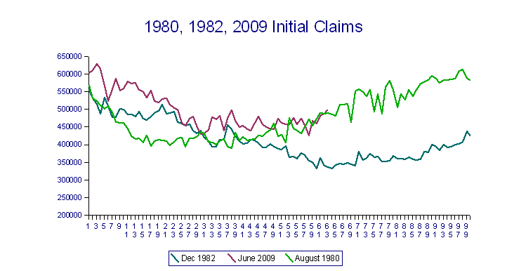
As always, left click to get a larger version or right click to open the larger version in a new window or tab.
This smarts. A very, very bad trajectory.
If we were in a recovery summer, it would look more like the bottom line (1982) on this graph:

It's not so much that claims remain elevated, but that claims are following the wrong trajectory. This represents a consistently low trend for the generation of new jobs.
For what it's worth, I think that initial claims will move back down after the middle of September, because I am sure that this three week rise in claims has to do with claims relating to education, and they all should be in the pipeline already by the middle of September.
But I was already sure that the retail orders had overshot somewhat. So far we are continuing the industrial growth pattern, and that is infusing some underlying strength. But excess industrial capacity is still a big problem, so it's not going to overcome new sources of weakness.
Congress screwed up badly by not extending both the original tiers of unemployment and extending the eligibility date for them. As of the April 1st initial claims report, there were 5.9 million people on EUC, and another 5.1 million on standard unemployment. As of the July 29th initial claims report, there were 3.2 million people on EUC, and 4.6 on standard unemployment. Congress did pass (late) an extension of the ability to transition from tiers until November 27th, 2010. However quite a few people have run out their unemployment benefits and can't find jobs. There is no help for them. (More facts about EUC here in pdf form.)
So if you look at the August 19th report, you see that the number of people receiving EUC has risen again to 4.75 million. But the group of unemployed who are not getting any benefits other than perhaps welfare and/or food stamps keeps rising.
Now the economy had generated some jobs in the private sector over the April-July period, but if you look at the household survey of the employment report, the total number of employed people had dropped by over 500K during that period (far beyond the statistical validity point). A lot of that was Census jobs dropping out but there also seems to have been additional losses of other government jobs, and I am guessing we will see that trend continue in the August and September employment reports.
So we haven't moved most people net from unemployment to employment. We have moved some who qualified for Social Security to retirement, but we aren't even adding enough jobs to maintain the number employed.
This means that income flows to the population are impaired.
Now add to this the fact that under current law, a huge tax increase is set to go into effect next January. This is a recipe for a great deal of economic uncertainty. In particular, it is probably preventing some business investment due to uncertainty about the ability to pay for it (you pay investment loans with after-tax dollars). The Bush tax cuts and the Obama stimulus tax cuts ($400 credit) are supposed to expire next year, and I have to believe that in one way or another many families will be paying more tax.
If you take the administration seriously, the intention is to keep the lower tax rates for many individuals, although it seems that Congress intends to raise taxes on far more individuals than Obama's campaign rhetoric would indicate.. However the administration's expressed intention is to raise taxes on many corporations, to raise capital gains taxes hugely, etc. None of that is likely to produce more jobs.
As far as I can see, we are on track for at least a few months of NOMINAL GDP CONTRACTION this year. That's much more serious than real contraction. Technically this would suggest that NBER's criteria for the end of recession (return to previous peak) will not be reached in 2010.
The uncertainty about taxes makes it very difficult to project into 2011. Assuming that plans to raise taxes are substantially scaled back, we would most probably see a skimming contraction with GDP oscillating between quarters of mild growth and quarters of mild contraction. Assuming that taxes are substantially raised, we should subside into a milder (than 2008/09) but sustained contraction by the second quarter of 2011.
There are already substantial future tax-and-cost increases built into Obamacare. Additionally, the wild cards involved in state and local tax increases are still being thrown on the table with some consistency. (See the Tax Policy Blog of the Tax Foundation.) Therefore we cannot plausibly assume that the net tax burden will fall in 2011 - it appears that it is doomed to rise under any scenario.
Finally, including the cost of medical insurance/care deductions reduces private incomes further in both 2011 and 2012. Therefore it appears that we are going to have a hard time getting private wages back to their level of 2008 over these two years.
The incentive to deleverage consumer debt ex RE among higher income earners is massive. I cannot look at all of this and be precise, but I would say that we are facing a very deflationary two years. I expect real private median incomes to shrink rather than increase. I also expect those with excess income to pay down debt first and to build savings more rapidly.
Saturday, August 21, 2010
Interesting Things
The rather long conversation in the comments on the last post is very interesting, at least to me. Whether we like it or not, we have to negotiate a feasible compromise on raising as much revenue as we can while preserving decent growth rates in the economy. It is always interesting to see how people think about this.
I have bursitis of the left arm and shoulder in three joints. It's due to an infection, and this is causing me extreme pain, which is why I haven't posted much and haven't responded to most the comments. The hunt-peck-gasp-and-sweat method of communicating by keyboard is very frustrating.
But I believe I am getting better, because A) I managed to get dressed today although it was a sweaty and painful endeavor, and B) I had enough interest in life to take this BBC sex differences test.
My overall score was 0 (totally neutral) but when I go through the individual tests it looks to me that's because of fliers. For example I got a perfect score on the spatial rotation test, but I also was way better than either sex norm on the verbal test. IMO I am far more on the female side, and sure enough, I find masculine faces attractive. I did not need this test to tell me that. I had noticed. I'm 49. You figure these things out in your teens.
So I'm figuring that there is a scaling problem here - if you are a person who is good at most things, the test is not sensitive enough to pick up the sex-related differences.
And speaking of scaling differences, my suggestion to Mark is that the Gini coefficient (map explanation) is not really sensitive enough to pick up some very important economic essentials. One of those essentials is persistence. In other words, if lower income/asset members of the population are likely to gain more income and assets over the course of their lifetime in an economy, the situation is very different than an economy in which the Gini coefficient may be lower but the ability to change positions in the income hierarchy is very limited.
It is also more important in societies with relatively high standards of living to look at the bottom 20% compared to the middle third.
And, even if all other things are equal, a society with a high standard of living that accepts a lot of immigrants without screening for wealth or assets will wind up with a higher Gini coefficient. The new arrivals are generally from poorer countries; they arrive poor and with limited language skills, and if enough of them come they literally drive down earning potential for the jobs for which they are qualified. The exception to that is in an industrial country with a lot of laboring positions, but still, if enough come they will drive down wages.
Look at the map and look at Canada and Australia - both light green. Both countries have generally had extremely selective immigration criteria. Canada has been far more lenient lately, but note the comments in this 2006 Toronto Star article:
China is almost unique because a lot of its industrial workers are basically illegal immigrants within their own country. They don't have residence permits to be in the areas in which they work, and thus they are not eligible for the most part for free schooling for their children or social benefits such as unemployment.
I have bursitis of the left arm and shoulder in three joints. It's due to an infection, and this is causing me extreme pain, which is why I haven't posted much and haven't responded to most the comments. The hunt-peck-gasp-and-sweat method of communicating by keyboard is very frustrating.
But I believe I am getting better, because A) I managed to get dressed today although it was a sweaty and painful endeavor, and B) I had enough interest in life to take this BBC sex differences test.
My overall score was 0 (totally neutral) but when I go through the individual tests it looks to me that's because of fliers. For example I got a perfect score on the spatial rotation test, but I also was way better than either sex norm on the verbal test. IMO I am far more on the female side, and sure enough, I find masculine faces attractive. I did not need this test to tell me that. I had noticed. I'm 49. You figure these things out in your teens.
So I'm figuring that there is a scaling problem here - if you are a person who is good at most things, the test is not sensitive enough to pick up the sex-related differences.
And speaking of scaling differences, my suggestion to Mark is that the Gini coefficient (map explanation) is not really sensitive enough to pick up some very important economic essentials. One of those essentials is persistence. In other words, if lower income/asset members of the population are likely to gain more income and assets over the course of their lifetime in an economy, the situation is very different than an economy in which the Gini coefficient may be lower but the ability to change positions in the income hierarchy is very limited.
It is also more important in societies with relatively high standards of living to look at the bottom 20% compared to the middle third.
And, even if all other things are equal, a society with a high standard of living that accepts a lot of immigrants without screening for wealth or assets will wind up with a higher Gini coefficient. The new arrivals are generally from poorer countries; they arrive poor and with limited language skills, and if enough of them come they literally drive down earning potential for the jobs for which they are qualified. The exception to that is in an industrial country with a lot of laboring positions, but still, if enough come they will drive down wages.
Look at the map and look at Canada and Australia - both light green. Both countries have generally had extremely selective immigration criteria. Canada has been far more lenient lately, but note the comments in this 2006 Toronto Star article:
An endless stream of newcomers arrives in the big cities with few options but to work in poorly paid jobs such as cleaning houses and driving taxis. Wages of these jobs are thus kept low and the occupants of them have little chance to get ahead.Then read this November 2009 article focusing on the recent changes involving the bad economy and the growing number of illegal workers. Canada has historically generally had a labor shortage, but they are walking a fine line here and it is exacerbated by the population concentrations. Compared to the US, they don't have a problem, but the Canadian ethos is quite egalitarian and it troubles them more. Note that the changes in immigration were quite recent. In the US, we have pretty much followed an unrestricted southern immigration policy for over 20 years. It has sharply driven down labor prices.
Previously, poverty levels among immigrants were about the same as those of the Canadian-born. Now they are much worse. According to a report by the Canadian Council on Social Development, whereas the poverty level of those who arrived before 1986 was 19.7 per cent, or slightly lower than that of the Canadian-born, the poverty level of those who came after 1991 was an alarming 52.1 per cent, while that of people born in Canada remained unchanged at around 20 per cent.
If this trend is not reversed, Toronto and Vancouver will by 2020 be home to an entrenched underclass living in slums. Because of gentrification and rising property values in the central cities, these slums will be located in the suburbs, requiring long commutes for those fortunate enough to have employment.
Fan Yang, a reader of the Toronto Star, shrewdly analyzed the impact of federal immigration policy in a letter to the newspaper in 2003. He accused the federal government of "dumping more cheaply acquired labour into the domestic labour pool, regardless of whether there is a healthy demand. Businesses welcome that enthusiastically as they bear no direct cost of unemployed immigrants and only garner the rewards of lower labour costs."
China is almost unique because a lot of its industrial workers are basically illegal immigrants within their own country. They don't have residence permits to be in the areas in which they work, and thus they are not eligible for the most part for free schooling for their children or social benefits such as unemployment.
Thursday, August 19, 2010
Well, That's Ripped The Recovery Summer A New One
I have been wanting to chalk some of the sharp rise in initial claims up to special factors (re-apps after Census, mfrg schedules, etc). But I give up.
Despite the generally positive, although clearly slowing, readings on various manufacturing type indices, initial claims of 500,000 with a four week moving average of 482,500 cannot be ignored. We are also seeing the consistent pattern of upward revisions (which has been in effect much longer than the sharp rise) which generally augers trouble. Also, the pattern is discontinuous with the other factors which should already have peaked.
At the beginning of this year I targeted these claims as a way to distinguish a slow recovery from a double-dip type pattern. So I can't dodge it now, can I? I guess I better update the claims graph and take my medicine like a middle-aged twit. Who Struck John is clearly winning this argument! (No doubt much to his displeasure.)
We'll see what the next few employment reports look like. My guess is that we are seeing the state and local financing problems feed through into employment.
Okay, so now it's time to figure the base and extrapolate from there. The retail slowdown is clear, although not dire. Industrial indices are still okay. However price increases have cut further at the lower and broader levels of the population/consumption pyramid. It will be interesting to see Philly Fed. And then on to tax data for personal incomes to figure the base.
From there I can adjust my expectations. Lending surveys show that lending is loosening a bit at the bigger banks, so that is less drag. However the bigger banks have mostly cut their loan reserves too much as far as I can tell, so one can't be too optimistic.
In the spring I figured two dip scenarios. One was for a fallback in consumer with a slow industrial uptick on a lower dollar that basically hauled us through a series of oscillations between mild contraction and mild expansions (a skimming recession over 8-9 more quarters). The second was for a deeper and more protracted contraction which emerged into stronger growth in 2012.
Oh, lalalala, why does it feel like Friday the Thirteenth? Philly Fed goes negative!

Following a crummy Empire survey, this packs more wallop. Here's the whole thing, and it's salted with little nuggets like:
Despite the generally positive, although clearly slowing, readings on various manufacturing type indices, initial claims of 500,000 with a four week moving average of 482,500 cannot be ignored. We are also seeing the consistent pattern of upward revisions (which has been in effect much longer than the sharp rise) which generally augers trouble. Also, the pattern is discontinuous with the other factors which should already have peaked.
At the beginning of this year I targeted these claims as a way to distinguish a slow recovery from a double-dip type pattern. So I can't dodge it now, can I? I guess I better update the claims graph and take my medicine like a middle-aged twit. Who Struck John is clearly winning this argument! (No doubt much to his displeasure.)
We'll see what the next few employment reports look like. My guess is that we are seeing the state and local financing problems feed through into employment.
Okay, so now it's time to figure the base and extrapolate from there. The retail slowdown is clear, although not dire. Industrial indices are still okay. However price increases have cut further at the lower and broader levels of the population/consumption pyramid. It will be interesting to see Philly Fed. And then on to tax data for personal incomes to figure the base.
From there I can adjust my expectations. Lending surveys show that lending is loosening a bit at the bigger banks, so that is less drag. However the bigger banks have mostly cut their loan reserves too much as far as I can tell, so one can't be too optimistic.
In the spring I figured two dip scenarios. One was for a fallback in consumer with a slow industrial uptick on a lower dollar that basically hauled us through a series of oscillations between mild contraction and mild expansions (a skimming recession over 8-9 more quarters). The second was for a deeper and more protracted contraction which emerged into stronger growth in 2012.
Oh, lalalala, why does it feel like Friday the Thirteenth? Philly Fed goes negative!
Following a crummy Empire survey, this packs more wallop. Here's the whole thing, and it's salted with little nuggets like:
Indexes for new orders and shipments also suggest a slowing this month; the new orders index fell slightly, to -7.1, while the shipments index turned negative, declining to -4.5. Indicating weakness, indexes for both delivery times and unfilled orders remained negative this month.Yeah, that would rouse a bit of concern! So far Chicago PMI has been hanging in with real strength. We'll have to see how the next few months go. The Empire State survey was much better than Philly, although shipments and new orders did turn negative.
The percentage of firms reporting a decline in employment (23 percent) was higher than the percentage (20 percent) reporting an increase. More concerning was the significant drop in the average employee workweek index from 1.7 in July to -17.1 in August.
Monday, August 16, 2010
They Never Fail To Astound
Exhibit 1: A rather good WSJ article on boomer and retiree spending. The article notes that even in 2008, retiree spending had dropped significantly compared to 1999:
Exhibit 2: Carliner of the Harvard University Joint Center for Housing Studies writes in Bloomberg. You should read this article for its deep and profound insights amounting to stand-up comedy. This article defines Ivy retardation.
Carliner's basic thesis is that housing must appreciate before most people will buy. This is quite wrong, of course - only speculators buy with the expectation of rolling houses for their appreciation. Housing is driven by first-time buyers, and first-time buyers buy when they can afford to do so, and that is usually when the MONTHLY COST OF BUYING is close to or less than the cost of renting.
That's why, historically speaking, low mortgage rates have stimulated the housing market. All the evidence shows that first-time buyers do not generally know what the heck they are doing and will buy on an affordable mortgage even if it means that they will lose their shirts three to five years out. They're generally young, generally dumb, and generally over-optimistic. That's youth, and that's what keeps the world rolling along.
Carliner ends with this:
I will slowly be returning to blogging action, and I will comment further on these two articles.
If you want to read these articles and think about them, here are a few questions that Ivy retards apparently aren't asking:
A) Might the failure of low, low, low mortgage rates to stimulate housing have anything to do with demographics?
B) Might the failure of low, low, low mortgages to stimulate housing have anything to do with lower real wages for the young-dumb-optimistic crowd?
C) Wasn't the failure of the "affordable-and-innovative mortgages" of the housing bubble preordained because it could get people into homes but couldn't make those homes affordable in the long run?
D) Can a general housing tax credit EVER make homes more affordable over the long run for most people?
As of 2008, the latest data available, people aged 65 to 74 were spending 12.3% less than they did ten years earlier, in inflation-adjusted terms. They cut spending on cars and trucks by 46%, household furnishings by 35% and dining out by 27%. At the same time, they spent 75% more on health care and 131% more on health insurance.No kidding. For retirees who have saved, the change in Social Security (CPI calculation change constantly lowers Social Security) has been cutting away at them even as most have seen much higher "must" expenses. Among those expenses not listed are that for many, their property taxes have risen sharply over the last ten years. Now they are looking at a decade of very low returns on their savings. Most boomers near retirement have seen hefty investment losses and will not recoup them over the next decade.
Exhibit 2: Carliner of the Harvard University Joint Center for Housing Studies writes in Bloomberg. You should read this article for its deep and profound insights amounting to stand-up comedy. This article defines Ivy retardation.
Carliner's basic thesis is that housing must appreciate before most people will buy. This is quite wrong, of course - only speculators buy with the expectation of rolling houses for their appreciation. Housing is driven by first-time buyers, and first-time buyers buy when they can afford to do so, and that is usually when the MONTHLY COST OF BUYING is close to or less than the cost of renting.
That's why, historically speaking, low mortgage rates have stimulated the housing market. All the evidence shows that first-time buyers do not generally know what the heck they are doing and will buy on an affordable mortgage even if it means that they will lose their shirts three to five years out. They're generally young, generally dumb, and generally over-optimistic. That's youth, and that's what keeps the world rolling along.
Carliner ends with this:
The reality is that the real estate market won’t fully recover until builders and consumers start believing once again that housing is a relatively safe investment with reasonable returns, and that will take some time.Hmm. All this carefully avoids any helpful projections, doesn't it?
I will slowly be returning to blogging action, and I will comment further on these two articles.
If you want to read these articles and think about them, here are a few questions that Ivy retards apparently aren't asking:
A) Might the failure of low, low, low mortgage rates to stimulate housing have anything to do with demographics?
B) Might the failure of low, low, low mortgages to stimulate housing have anything to do with lower real wages for the young-dumb-optimistic crowd?
C) Wasn't the failure of the "affordable-and-innovative mortgages" of the housing bubble preordained because it could get people into homes but couldn't make those homes affordable in the long run?
D) Can a general housing tax credit EVER make homes more affordable over the long run for most people?
Wednesday, August 11, 2010
Asking For Prayers
For my brother, my sister-in-law, their daughter and the twins, for whom there seems to be very little hope.
My brother is developing some very bad physical symptoms and is refusing to go to the doctor. Pray for comfort and wisdom for them all, because this body count might be about to escalate.
Update 8/13: There does seem to have been a change for the better in my brother's family's situation. Again, thank you. I do not believe that prayers work when the intent is not there, but I do believe prayer works when the intent is there but the ability to execute the intent is not. Prayer does not violate free will, but rather restores it. You will understand that I shouldn't give highly personal details, but the restoration of free will does seem to define what happened yesterday.
And may I ask for one more favor, since someone out there, or perhaps everyone together, seems to be able to catch the ear of the Almighty:
Shtove left a worse tale of a family in distress:
MOM, my sister in law got the all clear from her breast cancer treatment 3 weeks ago. She is 41 and has three beautiful young daughters. Today, she collapsed in the kitchen and smacked her head on the floor, out cold - brainscan has just revealed a tumour close to the skull, operation set for Monday.
That is awful. Please pray for that whole family and the doctors who will attempt to save this mother's life. Also, of course, for all those in like situations. Life is always shooting at someone.
I am working on a long series of post that hopefully will explain a little more of what I have been trying to get across, but I am very busy it may take me a while.
Further Update: My sister in law miscarried last night/this morning. Both twins were stillborn but so far she is doing well. Their daughter seems okay as well, although she is still on meds for the suspected Lyme.
And Teri has another prayer request, just as urgent as Shtove's:
Would you please add Linda to the list? She's my boyfriend's ex-girlfriend (they lived together years before we met.) She had bariatric a few months ago. She now has a brain infection and they doing surgery to remove some of the damaged areas. It does not sound good.
It certainly does not. Again, pray for the doctors and other medical staff as well as Linda and her family/friends.
Tuesday, August 10, 2010
Uh-Oh, Three Month Decline After April
Update 8/12: The first horseman of the second apocalypse has been sighted. Last week's initial claims were revised up to 482,000, and this week's advance initial claims is reported as 484,000. We have never made a more stupid mistake than in not extending some form of unemployment benefits for those who have recently lost their jobs in high-unemployment areas. (The unemployment extension is still just for those who lost their jobs a while ago.) I realize that initial unemployment claims are confusing to many, but the bottom line here is that this week's non-seasonally adjusted initial claims are 420,997, and last year's claims for the comparable period were 482,590. At that time we were still losing jobs pretty rapidly. If continued, claims at this pace are entirely consistent with a new contraction. If I had the time, I would update the 1980/1981 graph for you - we seem to be moving toward 1981. This week's four-week moving average is 473,500. I do not know of anything in the works that should distort initial claims this much. End update.
Wholesale Sales/Inventory ratios show signs of trouble:
This only goes through June, but the inventories rose 0.5 > 0.1 for the last two months, and sales dropped -0.5 > -0.7 for the last two months. In May durable sales rose 0.5 and in June they dropped -.02. And that doesn't seem so bad, except nondurable sales dropped -1.4 > -1.1 for May and June. So final demand is declining and orders will keep following.
NACM (National Association of Credit Managers, covers business-to-business credit) was released last week. The manufacturing index looked bad, although services rose a bit. But this index has shown an increasing pattern of month-to-month declines for three months. Take a look at their July report, and don't neglect the commentary.
Note that there is a stunning correlation across a wide variety of reports showing that April WAS the peak for the near-term. The only question now is how far down we will go? As of August, we are still in an improving economy, although the real pace of improvement has fallen hard, and price indexes (as measured by M_O_M) for consumer goods show that free cash in consumers' hands is due to be swallowed up more and more by the basics.
NFIB's July Small Business survey was pretty negative. Current factors are okay, but expectations are dropping rapidly. The small business outlook has fallen from 8 in May to -15 in July.
Why am I so sure that we are still growing? Well, if you look at NACM you see that credit sales are still in the pretty positive range, and the Fed's Commercial Paper (look at blue line for non-financials) is somewhat encouraging as well:
I say "somewhat" encouraging because look what it did in 2007. I prefer to see a slow steady increase rather than the pop up of recent months. You can argue this either way, because for many companies, the commercial paper market is delivering by far the lowest financing costs. So if companies are covering short-range financing needs on this market, and will get the money back to cover by profit on sales of products for which they are ramping up production (look at Chicago PMI), then everything's A-okay.
BUT, if companies find themselves squeezed by slightly lower sales and a slow-down in orders and then there is enough agita over this to raise commercial paper rates, then the weaker borrowers on this market might find themselves hit by something of a rate shock with revenues trending slower, base costs of production rising, and rates rising. So I will be watching this with some attention, because fundamental costs of production are going up as are crude product costs, but the sales trend looks iffy.
If you look at Commercial Paper Outstandings for Nonfinancial domestic, seasonally adjusted, you'll see that we may be nearing problem territory. And if you want to look at volume stats for AA Nonfinancial, you'll see that we are ballooning up at the short end (1-4 days), although in August so far we at least moved some to 10-20. So they are going for the low, low, low rates. A2/P2 Nonfinancial issues and volumes are dropping overall, although what there is out there is stuck in the 1-4 day.
The other side of the coin is H.8 Assets and Liabilities of Commercial Banks. Other deposits, which is basically your spendable cash for smaller businesses and consumers, is still rising but at a lower pace - 5.3% for June. So far for July the pace is picking up as it seems to be for large time deposits (Jumbos). The huge draw-down in large time deposits evaporated last month, so indeed that was mostly driven by the tax credit for housing. When the tax credit evaporated, so did that draw-down. And there should also have been a draw down in other deposits, so we will have to wait for a month or two to see what's really flying. One of the things I am wondering about is that when there was probably a partial shift from large time deposits to other deposits; I strongly suspect that in many cases parents pulled money out of CDs to give to kids for a hefty home downpayment.
Anyway, clearly the downturn risks are rising quite rapidly. I see no possibility that the economy can sustain growth in 2011 if all the Bush tax cuts expire, and the probability is very high that any significant tax increase could tip it back.
Q2 GDP should be revised down.
Friday, August 06, 2010
Employment Report July 2010
I said a bad word. Thank heavens I wasn't doing toddler duty. New rule: no reading of financial data while around children.
Before reading this in detail I probably need a sedative, because this is pretty dire. The unemployment rate did not change because the "Not in labor force" category increased by 381,000. Table A that the total of employed persons dropped by 159K lost in July. Note that the household survey data is far more accurate during transitional times in the economy than the establishment survey.
Since May of 2010:
Further glimpses into a Stephen King-type employment short story:
So we are still seeing some private sector recovery, but the state and local fiscal imbalances are now drawing down the ranks of government employed. I feel badly about the individuals involved, 85% of whom are never going to find such well-paying jobs again, but it is a necessary structural change to build a foundation for recovery. According to BLS, Census workers dropped by 143,000 in July, which accounts for only a part of the government job losses reported in Table A-8 (June 21,242,000 or 21.24 million; July 20,978,000 or 20.98 million).
PS: Since there is widespread agreement that this economy needs stimulus in some form or another, and since Social Security benefits are the major stimulus keeping this economy in a slow recovery rather than letting it slide back into contraction, shouldn't our focus shift to figuring out how to pay for Social Security rather than how to cut it while convincing people that we are helping the economy?
Before reading this in detail I probably need a sedative, because this is pretty dire. The unemployment rate did not change because the "Not in labor force" category increased by 381,000. Table A that the total of employed persons dropped by 159K lost in July. Note that the household survey data is far more accurate during transitional times in the economy than the establishment survey.
Since May of 2010:
- Total employed has dropped from 139.42 million to 138.96 million.
- The employment/population ratio dropped from 58.7 to 58.4.
- Total employed has dropped from 139.82 to 138.96 million
- The employment/population ratio rate dropped from 59.3 to 58.4.
Further glimpses into a Stephen King-type employment short story:
- Temporary employment fell by 6K in July.
- June's job losses were revised from -125,000 to -221,000. (Establishment survey) That's, um, kind of a big downward revision. (That's when the bad word popped out.)
- U-5 unemployment is stuck at 11%; U-6 unemployment rate is stuck at 16.5%
So we are still seeing some private sector recovery, but the state and local fiscal imbalances are now drawing down the ranks of government employed. I feel badly about the individuals involved, 85% of whom are never going to find such well-paying jobs again, but it is a necessary structural change to build a foundation for recovery. According to BLS, Census workers dropped by 143,000 in July, which accounts for only a part of the government job losses reported in Table A-8 (June 21,242,000 or 21.24 million; July 20,978,000 or 20.98 million).
PS: Since there is widespread agreement that this economy needs stimulus in some form or another, and since Social Security benefits are the major stimulus keeping this economy in a slow recovery rather than letting it slide back into contraction, shouldn't our focus shift to figuring out how to pay for Social Security rather than how to cut it while convincing people that we are helping the economy?
Thursday, August 05, 2010
Medicare And Social Security Trustees Reports
The Medicare report can be found on this page. It's almost 300 pages. Scroll down and use the 2010 link. I haven't been through this one in detail yet.
The Social Security Trustees report is only around 240 pages in pdf, found here. The meat and drink is found in the appendices, as always.
The bottom line for Social Security is that we are running a primary deficit, which will come close to break even or a little on the positive side in 2013-2014, and then we'll slump back into deficit.

Click on this image and open it up (or right-click to open in another tab) to get a readable version.
For all intents and purposes we've rolled over already.
When reading this, you want to ignore the first total. That includes the payments from the general fund.
Instead, add the next two columns (net contributions + net taxes on benefits) and subtract the next total (benefits + admin costs + RR payments).
So that's why the Catfood Commission has been set up. The commission is due to give its report after the election, and if you think that's coincidence you have a beautifully innocent mind.
To reiterate, the reason why the interest payments and trust fund stuff doesn't matter is that they are almost totally commitments from the general fund. If the general fund were running a surplus, that wouldn't be a problem. But the general fund isn't running a surplus, hasn't been and isn't going to be, so Social Security will be cut some more and benefits taxation will have to rise.
Beginning on page 155, you can find a table of the trust fund operations since 1955. This shows when taxation of benefits began and the relationship between benefit payments and OASDI receipts.
Beginning on page 147, you can find a table of the wage base and OASDI tax levels since inception. To get the total employee contribution rates multiply the rate given by 2 - because believe me, your employer includes those taxes when figuring your cost on the payroll. The employer portion is a closet tax on your pay, but at least you don't have to pay income tax on that money that you didn't receive.
For all practical purposes, we cannot raise social security/disability (OASDI) taxes any further. You will note that in 1960, the total tax was 6%. By 1990 that had risen to 12.4%. This has a lot to do with lower savings in the general population, not to mention various other correlated trends such as much lower mortgage downpayments, lower wages for most, and higher consumer credit balances. We started building this wall long before we crashed into it.
PS: These numbers really have not changed much. They move around a bit because of the recession, but really we knew these dates back in Clinton's term as president. Scroll down to the bottom of this post from 2005, and read the numbers there. Also see this post from 2005. I supported private retirement accounts then, and I do now. There is no way the average American will waste their own money as foolishly as Congress has wasted it. Back then I had already figured that 2015 was still a good exhaustion date (tax in < benefits and costs out).
Tuesday, August 03, 2010
Better Read CBO Report
CBO revised its long-term budget outlook today. Better read it. It's 90 pages, but you can go through the first two chapters and get the basics.
CBO's "alternative fiscal scenario" adjusts what the law says by what is already happening. When asked to score the health care bill, CBO has to use the provisions in the law that mandate cuts to Medicare. But Congress is not going to abide by those cuts, because physicians won't be able to treat a lot of people under the theoretical premiums. Congress has been overriding the basic law on those premiums each year, and it will continue to do so.
And then there are other theories. Anyway, CBO predicted today that US debt held by the public would reach 100% of GDP by 2023. So you'd better read it, because we have to make changes very quickly. At about 80% of GDP, borrowing costs should begin rising. Once that happens, it is hard to get out of the downward debt spiral, because spending cuts tend to be overridden by rising debt financing increases so it is very hard to reduce public debt at all. Certainly by 90% we'd be in that position.
And don't bring up Japan. Life is very rough for me about now and I might snap at you in the comments.
The difference between the US and Japan is that Japan has a positive current account balance, whereas ours is persistently negative. That means that Japan is earning extra in trade and income flows PLUS a great deal of government debt is held domestically. That means much of the interest the Japanese government pays on the debt basically goes back into its internal economy instead of being shipped overseas, and the rest offsets its current account surplus. Contrast that to the US, which has a lot of debt out internationally in order to finance our trade deficit.
These two factors have allowed Japan to keep generating more public debt without getting the Greek treatment,. So far. But now Japan is looking at attempting a program to stop growing their debt, and one of the reasons is demographic - as retirees age they will tend to eat up their savings for their retirements, plus tax receipts from the retirees are going to tend to drive revenues lower.
In any case, here is an excerpt from this CBO document, which probably should be classed as a Jurassic Park type of thriller/chiller drama (fiscally speaking):
So 11% + 6.2% = 17.2, and historically the US has had trouble growing the economy with taxation rates over 21%, or more feasibly 19.5%. Currently Medicare/Medicaid/Social Security are about 42% of the total government budget. That's one heck of an increase. Then add servicing costs on the debt, and paying for the federal government workers.
There's nothing left to even pay the military. This is bad because these guys and gals have guns and know how to shoot. On the other hand, that will make a great reality program, won't it? Imagine the Marines vs The Critters (staffers only, actual Congresspeople will be hiding in closets.) Gee, I wonder who will win?
Anyway, in Chapter 4 CBO shows its lack of faith in the theory that revenues can be raised much above historical rates and actually produce more revenue, commenting:
 As always, click on this little guy to view a larger graph (or right click and open it in another tab or window). It's not cuter up close. This graphs shows what CBO cynically expects revenues as a percent of GDP to be.
So basically we've got flat nothing to take care of welfare, food stamps, Congress Critters, farmers, windmill subsidies, corn ethanol subsidies, reckless bankers, student loans, the military, education, infrastructure, etc, etc, etc.
Translation: It's the demographics, stupid. Earlier CBO calculated that the average near-future retiree is going to be getting benefits of just 16.5K a year, which is why I harp on "Save, save, save." Cutting benefits is not all that feasible, is it? And the later boomers are all going to get that 16.5K only if they wait until 67 to retire, so good luck ratcheting that up.
And we already have a real problem with "retirees" pushing younger people out of entry-level jobs. If you think your son or daughter is going to be able to get a job when the 69 year olds are out there scratching for a living in the dirt, think again. For one thing, the retirees are mostly going on federal medical programs, so they are going to be much cheaper employees under the new health care rules, won't they?
Raising the retirement age has other implications. Most people in private industry are kind of dumped in an undignified fashion by 62. They can then live off savings, 401Ks and part-time or low wage jobs until 64 at least, which kind of gets them there as long as they don't have a lot of debt. But 70? BWAHAHAHAHAHAAAA. Not very likely.
It might amuse you to consider that most the theoretical "savings" from retirement age changes would really be eaten up by welfare, disability claimants, food stamps and the like. Many of these people will be tapping the social safety net for a few years to bridge to Social Security payments. There is another factor - as things now work, although disability rates rise sharply in the later years, most times early retirees have a partner to take care of them. If that partner is out working, then those people will increasingly be provided home or nursing-home care at the public expense. So don't think there is some magic bullet here - we still age, get sick and die.
CBO's "alternative fiscal scenario" adjusts what the law says by what is already happening. When asked to score the health care bill, CBO has to use the provisions in the law that mandate cuts to Medicare. But Congress is not going to abide by those cuts, because physicians won't be able to treat a lot of people under the theoretical premiums. Congress has been overriding the basic law on those premiums each year, and it will continue to do so.
And then there are other theories. Anyway, CBO predicted today that US debt held by the public would reach 100% of GDP by 2023. So you'd better read it, because we have to make changes very quickly. At about 80% of GDP, borrowing costs should begin rising. Once that happens, it is hard to get out of the downward debt spiral, because spending cuts tend to be overridden by rising debt financing increases so it is very hard to reduce public debt at all. Certainly by 90% we'd be in that position.
And don't bring up Japan. Life is very rough for me about now and I might snap at you in the comments.
The difference between the US and Japan is that Japan has a positive current account balance, whereas ours is persistently negative. That means that Japan is earning extra in trade and income flows PLUS a great deal of government debt is held domestically. That means much of the interest the Japanese government pays on the debt basically goes back into its internal economy instead of being shipped overseas, and the rest offsets its current account surplus. Contrast that to the US, which has a lot of debt out internationally in order to finance our trade deficit.
These two factors have allowed Japan to keep generating more public debt without getting the Greek treatment,. So far. But now Japan is looking at attempting a program to stop growing their debt, and one of the reasons is demographic - as retirees age they will tend to eat up their savings for their retirements, plus tax receipts from the retirees are going to tend to drive revenues lower.
In any case, here is an excerpt from this CBO document, which probably should be classed as a Jurassic Park type of thriller/chiller drama (fiscally speaking):
Under the extended-baseline scenario, which reflects current law, federal spending for those programs would grow from 5.5 percent of GDP today to about 10 percent of GDP in 2035; about 6 percent of GDP would be devoted to Medicare, and about 4 percent would be spent on Medicaid, CHIP, and the exchange subsidies. For the alternative fiscal scenario, CBO assumes that several policies designed to restrain federal spending on health care would not be continued. As a result, mandatory federal spending on health care programs would grow faster, reaching about 11 percent of GDP by 2035. Medicare spending would grow to about 7 percent of GDP, and federal spending on Medicaid, CHIP, and the exchange subsidies would reach about 4 percent of GDP.Of course that doesn't account for Social Security:
According to CBO’s projections, the number of people age 65 or older will increase by 90 percent between now and 2035, compared with an increase of just 12 percent over that period in the number of people ages 20 to 64.(Right here the astute reader dives under the blanket and grabs the popcorn - the scaly predators are closing for the kill)
CBO therefore estimates that, unless changes are made to Social Security, spending for the program will rise from 4.8 percent of GDP today to 6.2 percent by 2035.The screaming. The running!
So 11% + 6.2% = 17.2, and historically the US has had trouble growing the economy with taxation rates over 21%, or more feasibly 19.5%. Currently Medicare/Medicaid/Social Security are about 42% of the total government budget. That's one heck of an increase. Then add servicing costs on the debt, and paying for the federal government workers.
There's nothing left to even pay the military. This is bad because these guys and gals have guns and know how to shoot. On the other hand, that will make a great reality program, won't it? Imagine the Marines vs The Critters (staffers only, actual Congresspeople will be hiding in closets.) Gee, I wonder who will win?
Anyway, in Chapter 4 CBO shows its lack of faith in the theory that revenues can be raised much above historical rates and actually produce more revenue, commenting:
As a result, revenues as a share of GDP after 2020 are roughly 1 percentage point higher under the alternative fiscal scenario than the average share observed over the past 40 years. Revenues as a share of GDP have moved above or below that average between 1970 and 2010 but typically return to somewhere near the average, suggesting that changes in policy have offset other aspects of the tax system that otherwise would have tended to increase the revenue share over time. In the alternative fiscal scenario, CBO assumed that those sorts of policy changes would continue. Revenues as a share of GDP would increase from 15 percent of GDP in 2010 to just over 19 percent in 2020 and would remain constant at about 19 percent of GDP thereafter.This leaves one heck of a revenue gap:
 As always, click on this little guy to view a larger graph (or right click and open it in another tab or window). It's not cuter up close. This graphs shows what CBO cynically expects revenues as a percent of GDP to be.
So basically we've got flat nothing to take care of welfare, food stamps, Congress Critters, farmers, windmill subsidies, corn ethanol subsidies, reckless bankers, student loans, the military, education, infrastructure, etc, etc, etc.
Translation: It's the demographics, stupid. Earlier CBO calculated that the average near-future retiree is going to be getting benefits of just 16.5K a year, which is why I harp on "Save, save, save." Cutting benefits is not all that feasible, is it? And the later boomers are all going to get that 16.5K only if they wait until 67 to retire, so good luck ratcheting that up.
And we already have a real problem with "retirees" pushing younger people out of entry-level jobs. If you think your son or daughter is going to be able to get a job when the 69 year olds are out there scratching for a living in the dirt, think again. For one thing, the retirees are mostly going on federal medical programs, so they are going to be much cheaper employees under the new health care rules, won't they?
Raising the retirement age has other implications. Most people in private industry are kind of dumped in an undignified fashion by 62. They can then live off savings, 401Ks and part-time or low wage jobs until 64 at least, which kind of gets them there as long as they don't have a lot of debt. But 70? BWAHAHAHAHAHAAAA. Not very likely.
It might amuse you to consider that most the theoretical "savings" from retirement age changes would really be eaten up by welfare, disability claimants, food stamps and the like. Many of these people will be tapping the social safety net for a few years to bridge to Social Security payments. There is another factor - as things now work, although disability rates rise sharply in the later years, most times early retirees have a partner to take care of them. If that partner is out working, then those people will increasingly be provided home or nursing-home care at the public expense. So don't think there is some magic bullet here - we still age, get sick and die.
![]()
